Mobile Accessibility and the Robust Principle

Mobile Accessibility and the Robust Principle

The W3C wants to help developers understand how WCAG 2.0 applies on mobile devices. They recently issued the first working draft on the topic. The guidelines and principles of WCAG are explained using the POUR method: Perceivable, Operable, Understandable, Robust.

In this post I will distill the W3C information on the Robust principle.

The Keyboard

Set the virtual keyboard to the type of data entry required.

Data Entry

Make data entry as easy as possible by,

  • On-screen keyboard
  • Bluetooth keyboard
  • Speech or Touch
  • Use select menus, radio buttons, check boxes or automatically enter known information (e.g. date, time, location)

Support the Platform

Don’t disable the device’s platform characteristics such as zoom, larger fonts, and captions.

Mobile device image: William Hook

Mobile Accessibility and the Understandable Principle

Mobile Accessibility and the Understandable Principle

The W3C wants to help developers understand how WCAG 2.0 applies on mobile devices. They recently issued the first working draft on the topic. The guidelines and principles of WCAG are explained using the POUR method: Perceivable, Operable, Understandable, Robust.

In this post I will distill the W3C information on the Understandable principle.

Orientation

  • Support both landscape and portrait orientations
  • Changes in orientation must be programmatically exposed to ensure detection by devices such as screen readers

Consistent Layout

  • Within a particular size and orientation, repeated items should be placed consistently
  • Consistency between different screen sizes and screen orientations is not a requirement

Positioning before the Scroll

Position important items before the scroll.

Group Operable Elements

When two elements (e.g., an icon and a text link) perform the same action, group both items within the same actionable element.

 Be Clear About Which Elements are Actionable

Actionable elements such as links or buttons should be indicated by more than one means. Use combinations of shape, color, style, positioning, text labels, and conventional iconography.

Custom Manipulations and Gestures

Provide easily accessible instructions to explain what gestures can be used to control a given interface and whether there are alternatives.

Mobile device image: William Hook
Mobile Accessibility and the Operable Principle

mobile accessibility and the operable principle

The W3C wants to help developers understand how WCAG 2.0 applies on mobile devices. They recently issued the first working draft on the topic. The guidelines and principles of WCAG are explained using the POUR method: Perceivable, Operable, Understandable, Robust.

In this post I will distill the W3C information on the Operable principle.

Touch Target Size and Spacing

  • touch targets should be at least 9 mm high by 9 mm wide
  • touch targets close to the minimum size should be surrounded by a small amount of inactive space

Touchscreen Gestures

  • Gestures should be as easy as possible to carry out and two-step gestures should be avoided
  • To prevent unintentional actions, “elements accessed via touch interaction should generally trigger an event (e.g. navigation, submits) only when the touchend event is fired (i.e. when all of the following are true: the user has lifted the finger off the screen, the last position of the finger is inside the actionable element, and the last position of the finger equals the position at touchstart).”

Device Manipulation Gestures

These suggestions are for manipulations such as shaking or tilting:

  • Developers should still provide touch and keyboard operable alternative control options
  • Provide onscreen indicators that remind people how and when to use device manipulation gestures

Button Placement

  • Place interactive elements where they can be easily reached when the device is held in different positions or by different hands
  • Flexible use is the goal

Mobile device image: William Hook

Mobile Accessibility and the Perceivable Principle

Mobile accessibility and the perceivable princple

The W3C wants to help developers understand how WCAG 2.0 applies on mobile devices. They recently issued the first working draft on the topic. The guidelines and principles of WCAG are explained using the POUR method: Perceivable, Operable, Understandable, Robust.

In this post I will distill the W3C information for the Perceivable principle.

Small Screen Size

Guidelines include:

  • Use a responsive design and minimize the amount of information that is put on each page
  • Use fewer images
  • Focus on the features needed to operate in the mobile environment
  • Use a “reasonable” default size for content and touch controls to reduce the need for zooming
  • Make sure link text does not exceed the width of the device
  • Put form fields below their labels

Zoom/Magnification

The suggestions include:

  • The user should be able to zoom to 200%. Do not block this with the page’s viewport meta element.
  • Support system fonts that follow platform level user preferences for text size
  • Support options on the page to allow the user to change text size

Contrast

Mobile device content is viewed on smaller screens and in different conditions so the allowable ratio for lessened contrast on larger text on desktop devices must be considered carefully for mobile apps. Therefore, the W3C suggestion at this point is that developers should strive to apply the lessened contrast ratio only when text is roughly equivalent to 1.2 times bold or 1.5 times (120% bold or 150%) that of the default platform size. Even then, the user must be able to zoom to magnify the text.

Mobile device image: William Hook
Contrast Ratio: A New Color Contrast Tool

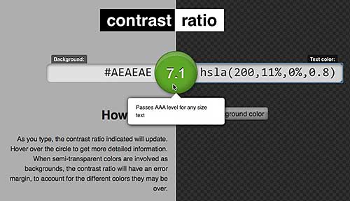
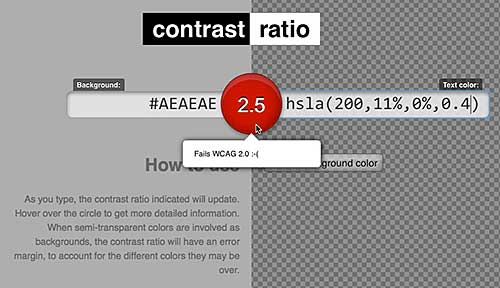
Here’s a very nice new tool for checking color contrast against WCAG 2.0 standards for accessibility. It was created by Lea Verou and is called Contrast Ratio.

The tool allows you to swap text color and background color. It permits the use of transparency in both text color and background color. If your color choices fail to meet the WCAG 2.0 standards, the ratio button in the middle of the page turns red. Hovering over the button tells you how many, if any, of the WCAG 2.0 standards your colors meet.

Hover over the middle button to see how you're doing
Hover over the middle button to see how you’re doing

Bump up the level of opacity a bit on this color scheme and it passes.

A passing color ratio

Directions on the page explain some fancy ways to change the values for text and background colors. These are fun and time saving, but the real value in the tool comes from the clear and obvious way it reports on how the colors test out against WCAG 2.0 standards.

Useful Links: Before/After WCAG 2.0, CSS acc, screen reader video, abbr

Before and After Demonstration at the W3C site shows a site before and after WCAG 2.0 principles were applied to it. It’s all annotated so you can see what was done to make the site accessible. Great tool for educators.

Speaking of the W3C, there is now a new community group forming – open to the public – that deals with CSS accessibility issues.

Videos of screen readers using ARIA, updated. Another great resource for educators from zomigi.

Nice time saver from Chris at CSS Tricks. Abbr elements all typed out to copy and paste. Abbr’s for Web Nerd Acronyms. <abbr title=”thanks to chris”>TTC</abbr>

Summary of eHow articles for April

A list of the articles I published on eHow in April. How-to galore.

Spring Flowers

It’s spring. It’s beautiful. It’s renewal, life-affirming renewal. Get outside and take a walk.

Here’s a list of what I published on eHow in April.