HTML/Text editor recommendations

I got this email the other day:

I have a rather odd request to ask. I am trying to learn how to write web pages for fun and maybe more down the road. At present I have several different editors to choose from, and was wondering if you could give me some advice as to which one I should use as my primary editor. I have: Dreamweaver CS4, Notpad++(sic), TopStyle Pro 4.0.0.85 and UEStudio ’10 as my potential editors. The thing is I really want to learn hand coding from the ground up. I have both of your books, Intergraded (sic) HTML and CSS and Mastering Intergraded (sic) HTML and CSS for my learning the basics. I also have PDF books on learning JavaScript and HTML5, more books than I know what to do with.

I haven’t seen anyone talking about editors on a blog for a long time. Because of that, I thought I’d give a rather lengthy answer. And a lengthy answer sounds like a blog post, does it not? Here’s how I answered the email.

Each of those tools has its own pros and cons. If you are serious about hand coding, you might find UEStudio, with its excellent HTML text editor UltraEdit as a good choice. Coupling that with TopStyle Pro for help with writing CSS and you have the basics covered.

UltraEdit beats out Notepad in my book because you have color coding, search and replace, FTP, and much more that isn’t available with Notepad.

Dreamweaver – which can be used as a text editor in Code View – adds another dimension you don’t get from other tools. If you aren’t great at typing or spelling, which your email hints might be the case, using Code View in Dreamweaver to type code is pretty typo-proof. There are many site management tools in Dreamweaver: link management, validation tools, site-wide search and replace, built in JavaScripts, FTP, CSS tools, image editing and more. Plus you have the WYSIWYG view if you want it.

Any one of these tools can get the job done. Which do you feel most comfortable working in? Which one makes the most sense to you? That one is probably the right choice for you.

I have dozens and dozens of web design books at my house, too. I’ve read them all. I’ve given away sacks and sacks of them to Freecycle folks. There are more books to come. In this field, there’s always something new, always something more to learn. Get the basic building blocks of HTML, CSS, and JavaScript under control and that gives you the foundation to build on.
How to Turn off the Admin Bar in WordPress 3.1 – Updated

I just upgraded to WordPress 3.1. I was dismayed to discover an admin bar taking up space at the top of my blog when I was signed in.

wordpress admin bar

Maybe you love the admin bar. I don’t happen to want it there.

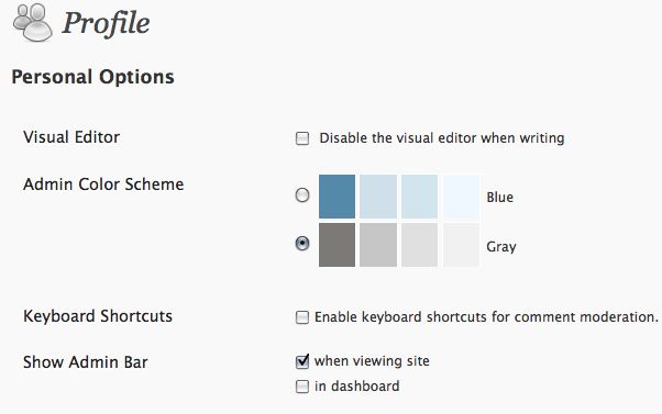
How do you get rid of it, if you are like me and don’t want it? Go to Users in your dashboard. Select a user and edit the profile.

User Profile in WordPress

You’ll notice that Show Admin Bar when viewing site is selected by default. Deselect. Save. You’re good to go.

UPDATE 2/27/11. If you want to disable the admin bar for a number of users all at once, instead of doing it one user at a time, here’s a solution from WordPress Support:

Need to add below code in theme’s functions.php
/* Disable the Admin Bar. */
add_filter( ‘show_admin_bar’, ‘__return_false’ );

Hat tip to Megan for bringing this solution to my attention.

Media queries 101

Media queries are part of the CSS 3 recommendations that worked beginning with HTML 4 and CSS 2. Lately they have been touted as a solution to designing for mobile devices. The trend has earned the label “responsive web design.” I thought it was time to look at the basics of media queries.

When you use media queries, you can set up style rules that are based on the media environment of the output device. You might have one set of styles for devices using landscape display, and another for devices using portrait display. Or you might write rules specific to the color bit depth of the output device.

The W3C explains,

A media query consists of a media type and zero or more expressions that check for the conditions of particular media features. Among the media features that can be used in media queries are ‘width’, ‘height’, and ‘color’. By using media queries, presentations can be tailored to a specific range of output devices without changing the content itself.

“A media type and zero or more expressions that check for the conditions of particular media features.” What does that look like in practice?

Start with an @media declaration that sets up the device and the conditions you want to meet. One way to do this is to create a specific stylesheet for various conditions and link to it. For example:

<link rel="stylesheet" media="screen and (color)" 
   href="example.css" />

This uses the familiar stylesheet link to set up a media type – screen – and a condition – the screen displays in color – and links to a stylesheet specific to those conditions. The same thing can be accomplished with the @import method of linking to a stylesheet.

@import url(color.css) screen and (color);

A more manageable solution is to link to a single stylesheet, and put @media rules in that one stylesheet. For example,

@media screen and (max-device-width: 480px) {
  .sidebar {
    float: none;
  }
  body {
    background-color: #fff;
  }
}

With @media rules in a stylesheet, the example style rule specifies a media type – screen – and sets up the conditions with terms and values in parenthesis – (max-device-width: 480px). Then, nestled in curly braces {}, one or more selectors and rule declaration blocks are used to create the desired style. The rules inside the enclosing curly braces will be applied only when the conditions are met. Otherwise, they are ignored.

Beyond the basics, you can get more specific and/or complex. You can use commas to set up a number of media types and conditions. There are operators such as and, not, and only that can set up more precise sets of parameters for applying styles.

The media types

  • all
  • handheld
  • projection
  • screen
  • tv
  • tty
  • braille
  • print

The media features

  • width
  • height
  • device-width
  • device-height
  • orientation (portrait or landscape)
  • aspect-ratio (the ratio of the value of the device-width media feature to the value of the device-height media feature)
  • device-aspect-ratio
  • color (bit depth of the device)
  • color-index
  • monochrome
  • resolution
  • scan (for tv)
  • grid (for tty or some phones)

Values

Values can be expressed in pixels, ems, dpi (dots per inch) and dpcm (dots per centimeter)

Further reading

Free eBook on fieldset CSS

The posts here on fieldset CSS are so popular, I decided to put them all together in one PDF file and offer it as a free download.

It’s a PDF file, so it isn’t perfect, but it does give you the information you may be looking for all in one place. If you have any problems with the PDF format, the posts are all available here on the blog. The included articles from the blog are:

Download Web Teacher on Fieldset CSS.

Here is the applicable Creative Commons license info.

How good link text makes you a better blogger

I’m going to tell you a little story and then I’m going to give you a quiz.

A few days ago, I posted a guest article by Lior called Increase your SEO Knowledge in 2011: Must Read Blogs. Lior sent me the post pasted into an email. I use Microsoft Entourage (a Mac mail program that is part of Office) for my email. In Entourage, the links Lior sent all looked like this:

This was a guest post written by Lior who is a marketing advisor to iAdvize, a live chat support software <http://www.iadvize.com/>  company.

I changed all the links when I was formatting the article for the blog post. I changed the links to the various blogs Lior recommended to h3 headings with links to the blogs. And I changed the last line of the article, with the guest author credit and link, to read:

This guest post was written by Lior who is a marketing advisor to iAdvize, a live chat support software company.

I didn’t give it much thought, I just made the site name the link as I had done with the blogs Lior recommended. Big oops.

Shortly after that, I heard from Lior, who didn’t like what I had done with the link in the author credit line. Then it got a little crazy, because every time Lior sent the “correction” to me, Entourage showed it exactly like the example above, with no clickable link text and a URL in brackets. Finally, Lior sent me a PNG, showing exactly how it should be.

How did Lior want it? Like this.

This was a guest post written by Lior who is a marketing advisor to iAdvize, a live chat support software company.

Okay, thanks to the PNG image, (with no help from Entourage) I finally got it.

The Quiz!

Now the quiz. Why was it so important to Lior to have live chat support software be the link and not the name iAdvize or not a URL in brackets with no link text?

I’m going to suggest three answers, any of which you may have thought of, and which may have been the reasoning behind Lior’s patient attempts to get me to do it a certain way.

Being an accessibility person, my first suggested answer is about accessibility. The link text live chat support software is the most descriptive about what to expect when the link is clicked. AT devices can be set to skip from link to link, reading only the link text until the user finds the link to click.  Think about how much more information Lior’s choice of link text gives a user than either iAdvize or a URL to iadvize.com. A link like iAdvize could be to all sorts of advice sites from financial advice to party planning. The words Lior chose tell the user exactly where a click will take them.

click here

As an accessibility aside, it’s not helpful when every link says click here. Nothing descriptive at all about that link text. In some situations, it can be a compelling call to action, but it needs a title attribute (plus alt text if it’s an image) that provide more descriptive information about the link destination.

Back to the quiz. Another possible answer involves search engine optimization. Search engines take a close look at link text. Good link text adds to your search engine ranking. It provides indexable information about where a link is going. That’s important to you in terms of links to posts on your own site. Links to your own internal pages or articles help the search engines find what’s on your site, and the text used for internal links makes a difference in how the information is understood.

Guest posters want credit, because it helps bring traffic and quality links to their own sites. Lior took time and effort to write the guest post and wanted to make it count with incoming link text that would improve search engine rank. Anyone needing chat support software will search on chat support software, and not on a word like iadvize. It can’t hurt to have incoming links with the words chat support software floating around the web when someone asks a search engine where to find chat support software.

Finally, there’s the usability answer. Good link text also improves usability. Clarity in link text removes confusion or ambiguity and makes the site more useful.

What else?

Was your quiz answer the same as any of mine? Or did you think of something else? How else could you answer my question?

I was syndicated on BlogHer.com

How to make HTML5 semantic elements more accessible

The new semantic elements in HTML5 hold accessibility promise. Here are some of the the new elements.

  • header: header can be used for a page element, a section, and article, or an aside element
  • footer: footer can be used for a page element, a section, and article, or an aside element
  • article: an article is a part of a page that is complete in itself with a heading, content, footer, and possibly sections
  • section: a section is a a section of a page; related content can be contained in a section but it should have a heading and may contain articles with their own headings
  • aside: the aside is tangentially related material on a page or as part of an article
  • nav: navigation

Accessible Rich Internet Applications Suite (ARIA), defines a way to make Web content and Web applications more accessible. It is used to improve the accessibility of dynamic content and advanced user interface controls developed with Ajax, HTML, JavaScript, and related technologies.

ARIA roles work now in many browsers and screen readers. When they don’t, they are harmless. If you build a page as accessibly as you can and then add ARIA roles into it where possible, you increase the potential accessibility of the page. This is currently the recommended best practice with HTML5 semantic elements.

An ARIA role is added as an attribute to the relevant element. The landmark ARIA roles are helpful with the new HTML5 semantic elements:

There are also a number of roles that describe structure on a page.

Here are a few examples of how to add the landmark role information to various elements:

<header role="banner">
<nav role="navigation">
<aside  role="complementary">
<section role="main">
<footer role="contentinfo">

Some roles can only be used once per page. banner and contentinfo must be unique on a page. In other words, while you can have many header elements on a page, only one header can fill the banner role.

[Note: This post was updated on June 12, 2014.]

See also: ARIA Roles 101 and ARIA States 101.

How I Use Tumblr to Help with Writing

You can do many things with Tumblr, but I use it for something very specific. When I’m researching a topic and want to gather up a set of links over a period of several days or weeks about that topic, I save the link on Tumblr. When I’m ready to put the information together in some other form, I go to my Tumblr page and quickly find it all.

For quite some time, I’ve been researching the topic of HTML5 and accessibility. I thought I’d share the list of resources I’ve amassed on this topic at Tumblr. Here are Virginia’s HTML5 and accessibility resources.

All this studying and collecting on the topic of HTML5 and accessibility is going to be put to use soon in a workshop at AccessU West 2011. Hope to see you there.