Secure your Server-Side Scripting

Locks for Sale

There is no web server existing within our society that proves fail proof. Web servers are often targeted in organizations because of the sensitive information they contain. Securing a web server proves as momentous as securing web or website applications and the networks surrounding them. If you have a secure web application that is paired with an unsecured web server or if this is reciprocated, your business will remain a substantial risk.

Securing web servers can prove frustrating and tedious along with requiring expertise, but it is not an impossible task. Ensuring the company web servers are secured will save your company from various headaches and data breaches in the future. No matter the operating system you have or web server software you are using, an out of the box configuration is always unstable. Companies should implement necessary tasks to increase the security of their web servers.

The following is a list of steps that should be taken to protect business web servers:

1. Remote access

Server administrators should always log onto local web servers. If remote access is warranted, you must ensure that the remote connection is properly secured. This is achieved by tunneling and following encryption protocols. It never hurts to use security tokens and other sign-on equipment. Do not use public computers or networks when you are accessing business servers remotely. This means that when you are enjoying a cup of java in the cafÈ, do not try logging onto business servers.

2. Remove services that are unnecessary

Default configurations and operating system installations are never safe. In standard default installations, network services that will not be used in web server configurations are installed. Some great examples of this are printer server services, RAS and registry services. When your operating system has an abundance of services running on it, this leaves open more ports, thus leaving more ìbackdoorsî for hackers to take advantage of. Disable and turn off all unnecessary services and this will ensure the next time you boot up your server, they will not start automatically. This task will also provide that extra boost to your serverís performance with freeing up hardware resources.

3. Server-side scripting and web application content

Web applications and or website scripts and files should always be on separate partitions and not that of your operating system, system files or logs. Hackers can easily gain access to the web root directory and exploit vulnerabilities.

4. Separate testing/development and production environment

It proves faster and easier for developers to develop new versions of web applications on production servers. It also proves standard that testing and development of these applications are performed directly on the production servers. Because these types of web applications are in early development stages, they usually have different vulnerabilities, cannot handle exceptions properly and they lack input validation. These applications can easily be exploited and found by hackers with using ordinary, free tools found on the Internet.

To deal with this issue, developers have begun to develop internal applications that allow access to the databases, web servers and other resources. The applications typically do not have any restrictions because they are merely testing applications that normally are only accessed by developers. If testing and development is not performed on a production server, they can easily be found by hackers which can help them gain access to the production server.

Testing and development of web applications should be performed on remote servers from the Internet and should never connect to or use real life databases and information.

5. Installment of security patches

Just because your web server contains fully-patched software does not assure its security. Ensure that you pay close attention to updating the operating system, and software running on it. Any hacker will admit that one of the easiest ways to take advantage of operating systems is through unpatched software and servers.

6. Audit and monitor the server

Logs should always be stored in a segregated section in web servers. Network services logs, database server logs, operating system logs and website access logs should be monitored regularly. If you see suspicious activity occurring on the server, the action should immediately be investigated to see what exactly is going on.

7. Privileges and permissions

Network and file services play a vital part in the security of web servers. If a web server becomes compromised through network service software, hackers can use the account where the network service is running from to carry out their evil deeds. It proves necessary to assign privileges warranted for network services to run. It is necessary to backend databases and information.

8. Use scanners

Scanners prove to be practical tools that aid in automating and easing the process of web application and web server security. Scanners that include port scanners can enable port scans on the web server hosting web applications being scanned. Scanners will initiate various security checks in reviewing network services and open ports that are running on your web server.
Remove software extensions and unused modules

Default Apache installations contain various predefined modules that are enabled. Ensure that you turn off these modules to prevent attacks to these modules. This also applies to Internet Information Services (Microsoftís web server). By default, IIS is configured to serve various large application types such as ASP. NET, ASP and more. The application list extensions should only contain the extensions the web applications or website are using. Each application extension should be restricted to using HTTP verbs only, whenever possible.

User accounts

Any default user account creating when an operation system is installed should be immediately disabled afterwards. It proves necessary to examine the long list of softwareís that have been installed on the server. This software should be checked regularly and frequently. The admin account should be renamed and should not be used; the same applies to the root user on a Linux/ Unix install. Any admin accessing the server should have their own user account with privileges. It is also highly recommended not to share your user account information with anyone.

Conclusion

In our modern era, tips and information on software and operating systems can easily be found on the Internet. It proves useful to stay informed while educating yourself about new tools and malicious attacks. One easy way to accomplish this task is by reading security-type magazines, forums, newsletters or other types of communities. Knowledge is power and the more you learn, the more you will be able to protect the security of server-side scripting.

Guest author Alfred Richards an experienced web designer and has profound knowledge of web hosting and web marketing, to know more visit his site VPN service.

Now Available: How to Create a Responsive Web Site Using Dreamweaver CS 5.5

I’ve been thinking of writing about using the Dreamweaver CS 5.5 interface to create media queries lately. Dreamweaver’s system works, but it isn’t easy to figure out and doesn’t match up with what you read in articles by Ethan Marcotte and other responsive design gurus. The interface doesn’t explain itself well, and offers very little intuitive understanding of what you are trying to do.

Virginia DeBolt's site

I wanted to rework my home page at vdebolt.com using Dreamweaver’s media query tools so I’d be sure I knew what I was doing before I started teaching Dreamweaver students how to use Dreamweaver to create a responsive design. My site is small and very simple–a perfect size for a brief class demo. It seemed a sensible idea to record my steps as I went through the process in Dreamweaver.

I quickly realized there was way too much information there to make it into a blog post. I ended up with 25 pages of text and images. An e-book seemed the perfect solution. I’m happy to announce the new e-book, available now: How to Create a Responsive Web Site Using Dreamweaver CS 5.5.

In the e-book, I start with a built-in Dreamweaver layout, adapt it so it will work with media queries, and then walk through the Dreamweaver WYSIWYG tools for adding media queries to make the layout responsive to various devices. I also talk about making images responsive in Dreamweaver.

The e-book costs $4.99. Order Here.

Should Your Blog Use Responsive Web Design?

Two trends converged during 2011. One from the world of Internet connected devices and the other from web site design world. Statistics show that more people are connected to the Internet through some sort of mobile device than through a desktop or laptop computer. Web designers are scrambling to make sure that web pages are going to work on all those devices – phones, tablets, and computers.

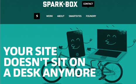
spark box responsive design
Image: Spark Box

The direction web designers are heading in this quest for universal access is called responsive web design.

Responsive web design is a way of organizing information and page layout so that a web page responds in an appropriate way to the device on which it’s viewed. On a large screen, the page might have two or three columns. On a tablet sized device it might have two columns. On a phone, it might have one column with simplified navigation. The images and the font sizes might be adjusted to fit the size of the device, too.

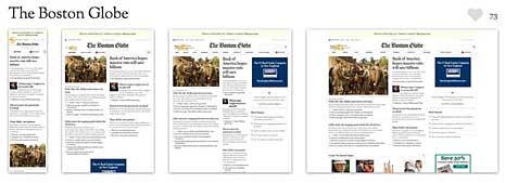
Want to see some examples of working sites that use it? Mediaqueri.es has a lot of examples. You can click through to look directly at each of the examples, such as the one at Spark Box. On Mediaqueri.es, the examples are shown in four sizes so you can see how each design looks at different widths like this example, The Boston Globe.

boston globe responsive design


It’s the same content in every case, it simply responds to the device with a different presentation of that content. Even if you only know a little about web design, you probably know that content and presentation are code words for HTML (the content) and CSS (the presentation).

Stay with me here on the content and the presentation. The HTML stays the same for every device. (Of course, the HTML you start with must be thought through so that your content can be laid out effectively for different devices. See Fluid Grids for more detail.) Add to that a few CSS rules aimed specifically at different types of devices. These CSS rules are called media queries.

Media Queries

Here are the rough basics of media queries.

In a media query, you specify a media type – screen, for example. Then you set up a feature for that particular form of media – width or color, for example. Check my fact sheet for a list of all the features (like screen) and resolution sizes for which you can write CSS rules.

You can put media rules in a separate style sheet for each device. If you do it that way, the link to the separate stylesheet looks like this:

<link rel="stylesheet" media="screen and (max-device-width: 480px" href="example.css">

In that linked stylesheet, you write rules that determine the display for any screen device with a maximum width of 480px, the width of an iPhone in landscape mode.

You can incorporate media queries into your existing stylesheet with @media rules. If you do it that way, you add this to your stylesheet.

@media screen and (max-device-width: 480px) {rules here}

At this point, all you have is the media query. You don’t have the style rule changes to make the design respond for various media features. Let’s say that your blog, at its computer screen width, has two columns. One floated left called “main” at 66% of the width and one floated right called “sidebar” that is 33% of the width. Here’s how you would turn off that layout for devices with a maximum width of 480 px.

@media screen and (max-device-width: 480px) {
#main {
float: none;
width: 100%;
}
#sidebar {
float: none;
width: 100%;
}
}

Now the two columns will line up one under the other, and look like what you see in the left-most image from the Boston Globe example above.

There’s a lot more to it, but that’s really all it involves: tweaking the CSS for various devices. For more in depth information you can check out the following.

Are there Blog Themes for Responsive Designs?

Yes, there certainly are. wplift has a list of both free and paid WordPress themes you can look through. Here are the Premium Themes. If you use the Genesis theme popularized by CopyBlogger at Studio Press, responsive designs are available for you. Search for responsive designs for your particular blog platform and you’ll probably find several choices.

Should You Rush Out and Get Responsive?

Well, that depends. You should investigate your audience and the sizes of devices that are using your site. Is your site one that people are reading at their leisure on a big screen, or one they are doing something with while on the run?

A while back, I wrote about some Useful WordPress Plugins for Your Blog. One in particular, WPTouch, made your WordPress blog more mobile friendly. I have that one working on my own blog now and don’t feel in a big hurry to choose a responsive theme yet because of it. You may feel pretty well covered in the mobile department in the same way I do.

On the other hand, I know the trend toward mobile is only going to grow. The need for web sites to look good and work easily on mobile devices is going to grow along with that trend. While there’s no rush, but there is the need to think about responsive design, learn about it, and choose a time to adapt to the idea of mobile design as an important consideration for your blog.

Have you Already Gone Responsive Design?

Do you have a blog that has already taken this design route? Please share.

Note: Originally written for BlogHer and cross-posted there.

Styling Lists 101

This week I’ve been sharing some material I wrote as handouts for a CSS class at UNM Continuing Ed. Here’s the one about styling lists.

Styling Lists

Lists are probably the most useful element on the web. They make things easier to read and they are great for navigation.

Bullet/numeral styles

For list-style-type on an unordered list, the options are square, circle, disc and none.

For list-style-type on an ordered list, the options are lower-alpha, upper-alpha, lower-greek, upper-roman, lower-roman, none, and a few other language types besides English.

With list-style-image you can replace the bullet in an ordered list with an image.

li {list-style-image: url(bullet.gif);}

Position

You can set the list as inside or outside with list-style-position.

ul {list-style-position: inside;}

Lists for navigation

Here’s how to style a list that will display horizontally. First set the list-style-type to none to remove the bullets.

#nav ul {list-style-type: none;}

Next, make the list items display inline and float left. This will make the list items line up horizontally rather than going down the page vertically. You can also add background colors in this step. A little padding between the items is helpful so they don’t run together. You can also set a width here so the menu fits the width of your container.

#nav li {display: inline;
float: left;
padding: 2em;}

Finally make the link (a) elements display as block. You can also add borders, padding, colors and other styling in this step.

#nav ul li a {display: block;
text-decoration: none;}

See also: Selectors 101, Styling Text 101.

Styling Text 101

Here’s another of the handouts I prepared for a Continuing Ed class in CSS at UNM.

Styling Text

There are many ways to control the typography on your HTML pages.

Fonts

Fonts are chosen in font-families. Usually pick more than one. Pick fonts that are all serif fonts and then end the list with the generic ‘serif’ for good measure.

h1 {font-family: Georgia, "New Century Schoolbook", Times, serif;}

Font names that include spaces need to be quoted. For sans-serif fonts, do a similar thing.

h1 {font-family: Arial, Helvetica, Verdana, sans-serif;}

Font-Weight

The choices for this property are normal, bold, bolder, lighter.

Font-Size

There are a few keywords such as small, medium, and large but generally it is best to use a relative measure such as % or em.

h1 {font-family: Arial, Helvetica, Verdana, sans-serif;
font-size: 1.35em;}

Line Height

Line-height can be expressed as a separate value, or in shorthand, given in the font rule immediately after the font size.  To add to the rule above and change it to a shorthand font rule with line-height, we’d get:

h1 {font: 1.35em/1.4em Arial, Helvetica, Verdana, sans-serif;}

Indentation and Alignment

The text-indent property will indent the first line of a paragraph.

p {text-indent: 3em;}

Horizontal alignment uses the text-align property. Possible values are left, center, right, justify and inherit. (For left to right languages)

blockquote {text-align: center;}

Vertical alignment uses the vertical-align property. Possible values are baseline, sub, super, top, text-top, middle, bottom, text-bottom, or a value in % or pixels. These properties only apply to text in table cells and inline. It doesn’t affect vertical alignment within a block level element.

Text Transformation

The text-transform property can change text to uppercase, lowercase or capitalize. Capitalize only affects the first letter.

Text Decoration

The values for text-decoration are none, underline, overline, line-through, or inherit. This property is frequently used to remove the underline from links.

a:link {text-decoration: none;}

Text Shadows

The CSS3 property box-shadow can be used to add drop shadows to text or other elements such as images. It’s a nice effect on heading elements. In shorthand, you first give a horizontal offset, then a vertical offset, then a blur distance (if you want blur) and finally a color.

Add this to your stylesheet to see how it works.

img {box-shadow: 4px 5px 3px #999999;}

See also: CSS Selectors 101

CSS Selectors 101

I’m preparing some handouts for an 8 hour continuing ed class in Cascading Style Sheets I’ll be teaching at UNM. The class doesn’t get a book so I have to write everything up myself. I thought I’d share some of the handouts here. The first installment: CSS Selectors.

CSS uses rules to apply styles to selected elements in your HTML documents. A rule consists of a selector and a declaration block. The declaration block is composed of pairings of properties and values.

h1 {color: red; background: yellow}

In that rule, h1 is the selector. The declaration block contains two declarations, one setting the color to red, the other setting the background color to yellow.

Types of selectors

  • Element selectors: These are HTML elements (or tags) such as h1, p, blockquote, li, img.
  • Grouped selectors: You can select several HTML elements or classes at one time using a comma separated group of elements.
    h2, p {font-size: 1.4em;}
  • Class selectors: These selectors let you target items that are independent of the HTML elements on the page. You create the names for these yourself. A rule for a class is preceded by a period in the stylesheet.
    .danger {font-weight: bold;}
    The class is then applied to an HTML element on your page:
    <p class=”danger”>Don’t drink Mercury.</p>
    More than one class can be applied to an element. Classes can be applied more than once on any given HTML page.
  • ID selectors: These selectors are also independent of any HTML element on the page and use names you create yourself. An ID selector is used only once per page. In the stylesheet, it is preceded by a pound sign:
    #lead {font-weight: bold;}
    It is applied to an HTML element on your page.
    <p id=”lead”>What a great lede.</p>
  • Attribute Selectors: These selectors allow you to choose elements based on some attribute they may have. For example, anything with the file extension .pdf or anything with a title attribute or anything with an href attribute. Here’s an example that selects something with a particular src attribute:
    img[src="img/students.jpg"] {border: solid 1px black;}
  • Descendent Selectors: These rules apply in certain structural or contextual circumstances based on parent-child relationships in a document. For example,
    p em {color:red;}
    Would apply only to em elements that were nested in (or descended from) p elements.
    li.sidebar a:visited {color:blue;}
    Would apply only to visited links in list items that were within an element with the class sidebar.
  • Adjacent Sibling Selectors: These select an element that immediately follows another element.
    h1 + p {margin-top:0;}
    That selects only p elements that are immediately after h1 elements.
  • Pseudo-Class Selectors: These basically apply to the states that anchor (a) elements may have and include a:link, a:visited, a:hover, a:active, and a:focus. A few other elements can accept pseudo classes, but they are not supported in all browsers.
  • Pseudo-Element Selectors: These insert “fictional” elements into a document .
    p:first-letter (font-size:3em;}
    p:first-line {color:purple;}
    h2:before {content: "]]"; color:silver;}
    label:after {content: " *";}

Resources

Attribute Selectors: They’re Unicorns and Rainbows

Guest post: Ten Ways to Generate Better Site Content

Content Management is a relatively new term in the web world. It’s a concept that has taken on particular importance as the marketing paradigm continues to transition to the digital world.

Before, your website was a static entity, a virtual sign post pointing to your brick and mortar business. Today, your website should be considered your virtual office. Your customers should be able to find out everything they want to know about you from your website, including a deep inference about why it is you are doing what you do. What makes you good at it? Why should they trust you? These concepts and more are conveyed by the content on your website.

content management

Your website content says things about you and your business.

Are you attentive to your customers?
Do you participate in community conversations?
Do you enjoy what you do?
What do your customers think about you?

All of these questions are answered by content on your site, and if you’re not putting thought and energy towards continually growing this information, customers will notice. When customers notice, search engines notice. Your website content should tell potential customers, either directly or indirectly, why they should work with you instead of the other guy.

Here are 10 tips for generating useful content for your website:

1. Prioritize Writing

Make writing a priority for you and your staff. You hired them because they are good at what they do. Expect them to deliver solid content that backs that up. If you do, you’ll benefit from their experience and help develop their talents even further.

2. Don’t Pass the Buck

Make the website somebody’s responsibility. If it’s not somebody’s job, it won’t get done. The buck will be passed until the buck stops coming back to you – okay cheesy metaphor – but you get the picture: without assigning ownership, good things get dropped.

3. Focus on Your Passion

Write about what you like. You’re in your field for a reason. You have a passion for what you do. Share it.

4. Frequency Trumps Overanalysis

Make small but frequent posts. Short and interesting is more valuable than long and dry. In addition, the search engines like it when they see more frequent posts while maintaining good quality.

5. Task Out Writing

Don’t take on all the writing by yourself. It can be tough to create solid, shareable blog posts and content. Instead, share the load. Give others an opportunity to flex their voice by offering guest spots in your news feed.

content is king

6. News Rules the Feeds

Write about things that are happening right now. Are you having a work related event? Share it with the web. Take pictures when you do things. Post about the story behind the picture. It makes for a much more interesting website or blog.

7. Get Social

At one time, one-way communication worked for businesses. Those days are gone. It’s time to integrate with social media outlets like Facebook, Twitter, and LinkedIn. Let your audience engage with you and you’ll earn back dividends of trust…and business.

8. Link Your Stories

Link associated stories together on your site. They don’t call it the ‘web’ for kicks. Integrating an internal linking strategy into your content generation plan brings your site together as a whole. It also helps with search engine rankings.

9. Share Your Sources

Though a professional journalist may keep their sources secret, you don’t have to. Share the industry-related sources that you find interesting or insightful about your field. If you find it interesting, others will too.

10. Publish Case Studies

If you’re good at what you do, no doubt some of your customers can vouch for you. Share those success stories. Writing about specific cases benefits both the vendor and the client. It makes for great marketing material too.

All of these items can take you to greater content management heights. The search engines will love you, your audience will appreciate it, and your business will grow. Better content management helps everyone!

About the author: Kimberly Clark is a senior web designer at VIA Studio. You can read more helpful tips at the VIA Studio Blog.