How to Put a Sidebar on a WordPress Twenty Eleven Page Like This One – UPDATED

I just changed the theme on this self-hosted WordPress blog. So – no big deal, it’s as easy as pressing a button, right? Not exactly. Not if you want to modify the theme. Not if you are in the BlogHer Ad Network and need an ad in a sidebar on both the main blog page, single blog post pages and site pages.
WT sidebar ad
There’s the required ad in my sidebar.

Here’s how I got that sidebar on every page. I started with the most basic theme you can get at wordpress.org: twentyeleven. There’s a newer one called twentytwelve, too. I chose this theme for several reasons.

  1. It comes from WordPress, made by WordPress, so I know I can trust it.
  2. It’s free.
  3. It has lots of bells and whistles, and it’s a responsive design. (See Should Your Blog Use Responsive Design?)
  4. It has a very simple and clean look, which I like.

The twentytwelve theme has lots of bells and whistles, too. It is a mobile first design. (See The Mobile First Craze.) I didn’t think I needed to go that far, so I stuck with twentyeleven.

The only drawback to this theme is that the single post pages (called Single in WordPress) and the individual pages (called Pages in WordPress) did not have sidebars. No sidebar, no ad space, which means I couldn’t comply with the BlogHer Ad Network requirements for running their ads.

I had to modify single.php and page.php to add the sidebar. And I had to modify functions.php. I’ll take you step by step through the process. You can do some of this in the WordPress admin area. I also used a text editor and an FTP tool.

Step 1: Install the Theme and Create a Child Theme

Use the blog admin area where you choose a theme to get twentyeleven ready to go. Or you can download twentyeleven from WordPress and add it to your site themes directory using FTP.

Here’s the thing. You have to have twentyeleven on your server, but you are not going to switch to that theme. You are going to use a child theme.

Making a child theme is actually easier than it sounds. You add another folder to your site’s theme’s folder. I did this using FTP, but you can use your site host’s control panels to add folders, too. Just make sure it’s in the themes folder and at the same level as the twentyeleven folder.

Nothing goes into the child folder, which I named twentyeleven-child, except a style.css file and a functions.php file. I started with blank files that I made by saving text documents with those two names.

Here’s the structure you need to see on your server, according to the WordPress Codex.

  • site_root (www)
    • wp-content
      • themes (directory where all themes are)
        • twentyeleven (directory of parent theme, Twenty Eleven)
        • twentyeleven-child (directory of child theme; can be named anything)
          • style.css (required file in a child theme; must be named style.css)
          • function.php (not required in a child theme, but needed to modify the pages to add the sidebars)

Once this child folder is in your themes folder, you will see the child theme as a option in the WordPress Appearance > Themes area where you choose a theme. Let’s do a couple of things to the CSS file before we choose it as the theme, though.

What Goes in the CSS File?

In the style.css file in the child theme, you start out with this:

/*
Theme Name:     Twenty Eleven Child
Description:    Child theme for the Twenty Eleven theme 
Author:         your name
Template:       twentyeleven
*/

@import url("../twentyeleven/style.css");

Upload this into the child theme folder.

When you use a child theme, the browser uses any modification you put into the style.css file, but it also looks up to the imported stylesheet for everything you don’t modify. So when you pick this child theme as your theme, the css file tells the browser what the parent theme is and where the parent style sheet is.

Okay. Now you can push the button in the WordPress theme admin area to choose the child theme. Take a minute and go look at your blog with this new theme.

You could do nothing more than this and your child theme would work. It would be exactly like the parent theme, so you probably want to create a few style rules of your own in the child theme that will overrule the rules in the parent theme.

Just as an example, I didn’t like the looks of the h3 tags in the parent theme. They were too small, there was too much white space around them, they weren’t in bold, and they were all caps. So I figured out which rule I wanted to change and added this to the child style sheet:

.entry-content h3,
.comment-content h3 {
	font-size: 16px;
	font-weight:bold;
	line-height: 1.6em;
	text-transform: none;
}

This takes precedence over the rule in the parent theme CSS file, so now I have h3 headings that I like better.

Step Two: Modify single.php and page.php

You need to add the sidebar to pages and single blog posts. You open single.php and page.php in a text editor and upload the changes by FTP. You are going to modify these pages in the parent theme folder, not add anything to the child theme folder.

Open single.php in the text editor. At the very end of the page add

<?php get_sidebar(); ?>

It should be immediately before this line:

<?php get_footer(); ?>

Do the same thing to page.php. Save them both and upload them to the server – back into the parent theme where they came from.

Step Three: Modify functions.php

Now we come to the functions.php file. I found these directions at Twenty Eleven – Sidebar on Single Posts and Pages and they worked perfectly.

Add the following code to the up-till-now blank functions.php file in the child theme folder. Don’t do anything to the functions.php file in the parent theme.

I have no idea what this php is doing, but I can copy and paste like a champ. The author of the code says it will, “Suppress the .singular body_class from the single post or page,” so the sidebar can be added.

add_filter('body_class', 'blacklist_body_class', 20, 2);
function blacklist_body_class($wp_classes, $extra_classes) {
if( is_single() || is_page() ) :
// List of the classes to remove from the WP generated classes
$blacklist = array('singular');
// Filter the body classes
  foreach( $blacklist as $val ) {
    if (!in_array($val, $wp_classes)) : continue;
    else:
      foreach($wp_classes as $key => $value) {
      if ($value == $val) unset($wp_classes[$key]);
      }
    endif;
  }
endif;   // Add the extra classes back untouched
return array_merge($wp_classes, (array) $extra_classes);
}

Now that you have something in your functions.php file, upload it into the child theme folder again.

Anything you put into your sidebar via widgets should now appear on every page of your blog.

An Alternative

After I had done all this, I discovered Extend WordPress Twenty Eleven Theme to Include Sidebars and More Flexible Options that uses an extension to do all this and more. Sound easier? You might give it a try first. One drawback – it won’t work using a child theme. WordPress recommends that modifications to a theme be done with a child theme.  But, if easier is better in your world, you might choose to ignore the recommendation to use a child theme and go with the extension. It gives you choices in the WordPress Admin area that let you select options to add sidebars.

[Editor’s Note: Cross posted on BlogHer in slightly different form.]

UPDATE: 1/25/2013.

Since writing this post I discovered a much simpler way of insuring that the sidebar appears on each single page you might want. The theme itself provides a sidebar template, which you can find in the page attributes section of the dashboard while you are editing the page.

Page Attributes

Select the sidebar template for the page and you are good to go.

Basic Knowledge for Bloggers

You don’t need to know anything technical to have a blog beyond how to get around on a website and follow instructions. It’s no more complicated than setting up an account on Amazon and ordering a book. But you could be a better and more effective blogger if you did take the time to learn some of the basics of how your website works.

blogger
Blogger by Virginia DeBolt via Flickr

Why would you be better and more effective, you ask? Here are a few reasons.

  • You would have more control over your website
  • You would be able to customize your website
  • Your website would work better in all devices
  • You would be better able to handle the inevitable technical issues that would arise
  • When you wanted to try something new, you would understand how to do it
  • You could avoid newbie mistakes

It’s worth a moment to explain the newbie mistakes item, and how it relates to the item about your website working better in all devices. The cleaner and simpler your HTML is, the better it’s going to work in all devices – from big old computer monitors to tiny smart phones. The biggest newbie mistake is forgetting that not everyone is looking at your website on your monitor, at your resolution, under your circumstances. Using those lovely tools above your text entry box on your blog dashboard to center text or images, to change the colors of text, to use several different fonts and text sizes, to add extra lines of space – all those things add complexity to your HTML. Adding complexity to something that works best when its simple and basic means that things may not work so well for someone who is not looking at your website on your monitor, at your resolution, under your circumstances.

If you want to start learning more about what goes on behind the scenes on your blog, here are the steps to take.

  1. Learn some HTML (Hypertext Markup Language). HTML is very simple, but it’s the foundation of everything else on the web. Using it right makes everything on your web page work better in every browser and in every device.
  2. Learn something about CSS (Cascading Style Sheets). Styles are what make your correctly marked up text look beautiful on a page.
  3. Learn a little about programming languages such as JavaScript and PHP. You don’t have to be able to write a program, but you should have a glimmer as to what’s going on when you try to customize things.

What I want to share with you in this post are pointers to places where you can get started with the basics of HTML, CSS, and programming. Just knowing the basics will be enough to make your blog more your own and more what you really want it to be.

Where to Learn the Basics of HTML

HTML is used to format text. Text is marked as a paragraph or a heading or a link or a list. When the text stops being a paragraph or a heading or whatever, the formatting is turned off. This works with tags that open and close the formatting – or you might think of it as turning on and off a section of formatting. Here are a few places to learn some HTML:

Where to Learn the Basics of CSS

CSS is used to control the appearance of everything you formatted in your HTML. It can set backgrounds, colors, fonts, positioning, whitespace, line height, widths and heights, how lists look, and much more. CSS doesn’t use tags, but it selects tags using a system of selectors. Once something is selected, a rule for how it will appear is written – and bingo bango, the way the selected item appears on your page is changed. CSS is more complicated than HTML, but you can start slowly with it until you get the hang of what you’re doing. Here are a few places to learn some CSS:

Where to Learn the Basics of Programming

Programming languages abound, but the most common ones bloggers run up against are JavaScript and PHP. The programming behind your website does the heavy lifting of making in interactive, making it possible to receive comments, and sending in mail from your contact form. Programming is the most complicated thing you need to learn about in understanding how the web works. Get a grip on the HTML and CSS first, before you start learning about programming. Here are a few places to learn something about programming:

What are you waiting for? Go get started on being a better blog owner.

[Note: Cross-posted at BlogHer.]

Tips for Success on Kickstarter

You have a killer idea for a product or project, but you have no money to make it a reality. Could Kickstarter be an option for you?

a kickstarter project
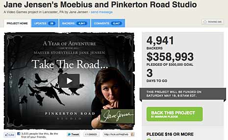
example project from kickstarter.com

Kickstarter won’t help you start a business or collect money for charity. But it will help you with a “project.” Here’s how Kickstarter defines a project.

A project has a clear goal, like making an album, a book, or a work of art. A project will eventually be completed, and something will be produced by it. A project is not open-ended. Starting a business, for example, does not qualify as a project.

If those qualifications fit your idea, here are a few tips to help you create a successful Kickstarter project.

It’s All or Nothing

On Kickstarter you set a goal. If you reach the goal you get the money. If you don’t reach the goal, you get nothing. It becomes really important to plan your budget carefully. Consider every expense that will be involved in making your project a reality and include that amount in the goal. You don’t want to get funded and then not have enough money to make your idea real because your goal was not high enough to complete the project.

Give Your Supporters a Reward

The people who believe in your project and give you funding need some token in return. Maybe it’s a copy of the thing your project makes. Maybe it’s an invitation to your opening night. Maybe it’s some form of recognition within the project itself. Maybe it something you create especially for your donors. But give something in return for the cash and the faith they extend to you. Don’t forget to figure the cost of sending people their rewards into your goal amount if the reward is something that needs to be mailed.

The Video is Your Sales Tool

Every Kickstarter project page has a video in which the person seeking funding shows the potential donors what the project is, why it’s awesome, and why they should help fund it. Kickstarter has some tips for making the video, including:

No matter how creative or bare-bones your video, you’ll want to:

  • Tell us who you are.
  • Tell us the story behind your project. Where’d you get the idea? What stage is it at now? How are you feeling about it?
  • Come out and ask for people’s support, explaining why you need it and what you’ll do with their money.
  • Talk about how awesome your rewards are, using any images you can.
  • Explain that if you don’t reach your goal, you’ll get nothing, and everyone will be sad.
  • Thank everyone!

Be sincere and show how much you love the idea – you must believe in yourself and let it show. You’re really selling yourself in the video. If you have a product your can demo in the video, do it.

You’re asking people for money. Give them all the information they would want to know before pledging their dollars. If you leave unanswered questions in their minds, they may hesitate to participate.

Keep People Updated and Promote, Promote, Promote

Your Kickstarter page will track donations, but use Facebook and Twitter and email to keep the updates going to to celebrate success as it builds. Social media tools will also help you maintain awareness among those who might help but haven’t yet.

Promote the project in every way that you can. Reach out to bloggers who might be interested in your type of project and see if they will write about it. Send press releases to newspapers. Pass out flyers. Do whatever you can think of to build awareness. (Without spamming everyone you know, of course.)

If you reach your goal and your project gets funded, all the awareness you’ve raised with your outreach on Kickstarter will help you market the project later on.

Be Quick to Reward

If you reach your goal, be quick to get those rewards out. And use the rewards contact with your supporters to tell them more about the completed project and where they can see or buy the item they helped fund.

Share the Celebration

If you get funded, share the celebration. Not just with the reward, but with outreach in the same way you promoted your project. Put photos on Facebook, or share success with your supporters in any way you can.

Cross-posted at BlogHer.

Improve Accessibility in HTML5 with WAI-ARIA Landmark Roles

html5 logo

HTML5 contains several new elements that are considered semantic in that they more accurately describe the content they contain than a generic element such as a div.

These new elements improve accessibility as standalone structure, because of the semantic underpinnings they carry with them. The elements in question are: header, footer, main, section, article, aside, and nav. Simply using them without any additional coding such as the WAI-ARIA landmark roles I’m going to describe today is an improvement.

The roles I’ll describe are banner, complementary, contentinfo, form, main, navigation, search. The names make the role pretty obvious, but some roles have fine points.

The header element

In HTML5, the header element can be used repeatedly on a page. It can be the main header for the entire page, or a header for a subsection of the page such as a section or an article or an aside.

If the header element is used at the main header for the entire page, the role banner can be assigned to it. Only one header on a page can have the role banner.

<header role="banner"> . . .</header>

Within the page there may be header elements used as article or section or aside headings. The ARIA role that can by used in that case is heading.

<article><header role="heading">Article heading</header>Article body</article>

The heading role can also be used in tables.

The footer element

In HTML5, the footer element can be used repeatedly on a page. It can be the main footer for the entire page, or a footer for a subsection of the page such as a section or an article or an aside.

The main page footer can use the role contentinfo. But footer elements for subsections of a page may not use this role. It can only be used once on a page.

<footer role="contentinfo"> footer for entire page</footer>

Depending on what kind of information is included in the footer for articles or other smaller page sections, the footer might be appropriately labeled with the complementary role.

<footer role="complementary"> informative footer for an article</footer>

 The aside element

The aside element is meant for complementary material, not crucial to the page content, but supplementary. Therefore the complementary role is perfect for it.

<aside role="complementary"> supplemental content</aside>

Main, Navigation, Form and Search

You’ve seen how simple it is to assign a role to an element, so I’ll stop giving code examples. There are just a few points about the roles main, navigation, form and search. It seems self-evident when to apply navigation, form, and search to page elements. But main is another role that can only be used once on a page to indicate the main content, which might be contained in a main, div or section element. Using the main role properly eliminates the need for those “jump to main content” links that were so prevalent for a while on the web.

ARIA Roles are not only for HTML5

The last point to keep in mind is that ARIA roles work in all flavors of HTML. They do not depend on the use of HTML5 to make your web page accessible. Even if you are not ready to switch to HTML5, you should begin using ARIA roles.

See Also: ARIA Roles 101 and How to Make HTML5 Semantic Elements more Accessible.

Finding the CSS3 possibilities in Dreamweaver 5.5

A brilliant examples of interface design that Dreamweaver designers use with some regularity is the CSS rule definition dialog window in Dreamweaver. This window has been approximately the same since the days of Macromedia when it was first instituted.

css rule definition dialog box

For many past versions of Dreamweaver, this dialog box covered the full range of what you could do to a generate a selector and write CSS for it. Since CSS3, it’s starting to show signs of age. Some of the new possibilities with CSS3 aren’t available in the options in the rule definition window.

That doesn’t mean Dreamweaver doesn’t have them. You just need to know where to find them.

Logically enough, the place to look is the CSS Panel. In the lower left corner of the CSS Panel, there are icons that allow you to look at CSS properties using either list view or category view. Here’s an example for a rule that uses border-radius to create rounded corners. Look at list view in the properties pane.

CSS panel list view

In list view, you see the list of potential properties that could be applied. The view shown is at the beginning of the alphabet. Those properties that have rule declarations assigned are indicated with information showing the value assigned. List view includes vendor prefix options listed in alphabetical order.

The other icon at the lower left of the CSS panel that will show you CSS3 possibilities is Category View. Here’s a look at the same rule with category view showing in the properties pane.

CSS panel category view

The categories are revealed using an accordion style slider to hide or show options. I have the Border category revealed here. Among other things, you see the CSS3 border-radius property. In Category view, Mozilla, Opera, Webkit, and Microsoft have individual category sections where you can find vendor prefix options. Scroll down to find the categories for various vendors to create rules for border-radius (or other properties) with vendor prefixes.


Using jQuery Mobile in Dreamweaver CS 5.5

Dreamweaver CS 5.5 has some built-in jQuery mobile functions that can help you design a mobile site. Going this route means one of two things:

  • You begin with the mobile site, enhanced with prebuilt jQuery Mobile functionality, and progressively enhance to create a site that will work on all devices.
  • You create a site just for mobile that is a separate design from your other site.

I’ll show you the basics of how to get started and what Dreamweaver is doing for you.

Open a new blank page using the DOCTYPE of your choice. Choose the jQuery Mobile category in the Insert panel. Choose the icon for jQuery Mobile Page, the first icon on the left in this view. (I like the Classic Workspace. Your view of the Insert panel may be different from this if you don’t use that Workspace, but the jQuery Mobile category will contain the same icons.)

jQuery New Page icon

Two dialog boxes appear. The first wants you to indicate whether you want to use the remote jQuery Mobile scripts and stylesheet, or install them locally. For this exercise, I’ll leave them as remote, but that might not be the best choice for actual use.

jquery mobile files dialog

The second asks you to assign an ID to the new mobile page. Dreamweaver suggest ‘page’ by default, which will be okay for this demo. You also choose whether or not to have a header and footer here.

jquery mobile page dialog

Clicking OK brings you back to the Dreamweaver document window. Let take a look at what your choices on the previous two dialog windows inserted into the document. The Design View doesn’t look like much.

jquery mobile basic page

What you Got Code-Wise

When you look at the Code View, you realize there’s a lot of work already done for you here.

jquery mobile basic code

  1. You see the links to the scripts and stylesheet. The styles show up in your Style panel and appear to be editable, but I would want to recopy them into a local CSS file myself just to be sure.
  2. You see that data-roles are assigned. This is how jQuery Mobile identifies what you are creating. One of the benefits of data-roles is that there are styling options associated with them.
When you look at the basic beginning page in Live View, you can see what the jQuery Mobile scripts and styles are doing for you in terms of presentation.

jquery basic live view

It needs work, but you have a start.

What else can you do?

Next, take a look at the rest of the options in the jQuery Mobile Category of the Insert panel.

jquery mobile insert menu

The first one on the left is the JQuery Mobile Page icon, already mentioned. From left to right, the others are:

  • JQuery Mobile List View
  • JQuery Mobile Layout Grid
  • JQuery Mobile Collapsible Block
  • JQuery Mobile Text Input
  • JQuery Mobile Password Input
  • JQuery Mobile Text Area
  • JQuery Mobile Select Menu
  • JQuery Mobile Checkbox
  • JQuery Mobile Radio Button
  • JQuery Mobile Button
  • JQuery Mobile Slider
  • JQuery Mobile Toggle Switch

I’ll walk through inserting one of these to give you an idea of what Dreamweaver does with it. How about the List View? I’ll create a space for it after the generic Header text and click the JQuery Mobile List View icon.

jquery mobile list view dialog

A dialog window opens. You choose the type of list, the number of items in the list, and several other choices including some pre-styled options if you want to use a split button. I’ll pick “Star” from the split button icons.

You see this in Design View.

jquery list in design view

You see this is Live View.

jquery list view in live view

This is what happened in Code View.

jquery mobile list view code

The other jQuery mobile icons work in a similar way. While this is just a beginning for you, it does get you off to an fast (and easy) start in designing a site specifically for mobile using jQuery Mobile scripts.

Going Responsive

If you are interested in taking a different approach with Dreamweaver CS 5.5 to create a site designed to be responsive and work in all device sizes, see my e-book How to Create a Responsive Web Design in Dreamweaver CS 5.5. Explaining how Dreamweaver helps you do that is a long story, so I packaged it as an e-book and am charging a small fee to download it.

Control Panel Basics

If you sign up for a web hosting account, you get this nice letter back from the hosting company that tells you all about how to connect to your server and where to find your control panel. If you’re a little new at the whole web hosting thing, you may wonder what in the name of cyberspace you are supposed to do with a control panel.

control
Control by Chicago Art Department via Flickr

It’s easy to be intimidated by a control panel your first time to log in to one, because we live in a time when tech stuff is supposed to be user friendly and intuitive and pretty. Control panels are none of that.

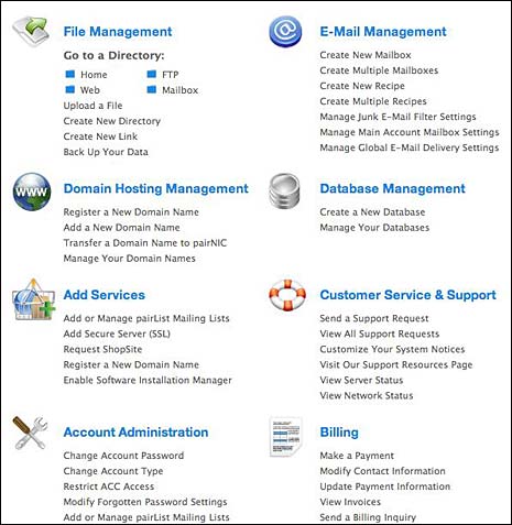
In spite of their clunky nature, control panels are important to you as a proud new owner of a web site because of what they do. Every hosting company doesn’t use the term control panel. A company I use calls it the “Account Control Center.” Other places call it the “cPanel.” Whatever it’s called, it’s the hosting company’s way of giving you a way to control some of the things about your account. Here’s what I see when I open my control panel.

C-panel menu
Image by Virginia DeBolt

Ah, you say. I see, you say. You can set up your e-mail address for your account. That sounds good. You can even ask for support, change your password, or pay your bill. But what is file management or database management or domain hosting management?

E-mail Management

You probably have a least a few e-mail addresses with your domain name. Use this part of the control panel to set up what they are called and where the e-mail goes that comes in.

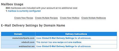
email management options
Image by Virginia DeBolt

You can see that I have 800 potential mailboxes with my account. Since I’m running things by myself, I only use one. But you can set up all sorts of email accounts: info@yourdomain.com, support@yourdomain.com, yourname@yourdomain.com and more. With my web host, you set up a new mail address by “creating a mailbox.” When the mailbox is set up, you may want to tell the server where to forward the mail using a “recipe.” I don’t know how this terminology came to be, but that’s what they call it. If you’re lucky, your C-panel will give it a more obvious name like “Forwarding.” Depending on the server, you may be able to get your e-mail directly from the server without having to forward it if you set up your e-mail client on your home computer properly.

Database Management

If you’re putting a blog on your web site, you need a database. Use this part of the control panel to create a new database. Usually all you have to do is click a button and the database is created. Take note of the settings they give you for it after it’s created, so you can tell your blog where the database is when you install the blog software. You can create backups of your database here, which you may want to do before you update your blog.

File Management

It’s awkward, but you can upload files to the server using this section of the control panel. FTP is easier to use, but this works if you need it. You can do other things here like set up new folders, change file permissions, and delete old log files so they don’t take up all your server space.

Domain Hosting Management

You can take care of your domain name in this part of the control panel. You can probably arrange new domain names that will be hosted under your main account too. This is cheaper than getting a new hosting account for every domain name you buy, and it keeps everything in one place so you don’t have to keep track of multiple web hosting accounts.

Just Breathe

The control panel may use some odd terminology. Just take your time and try to figure out what each part of it does and how it’s useful to you. Then take control of the control panel. You can do it.

Cross posted in slightly different form at BlogHer.