Using CSS background-image to style links

There are many ways to style links with CSS. One possible way is to use the background-image property to distinguish the various link states.

Link states are represented in CSS by selectors involving the a element, which targets an HTML a tag in a link like <a href="somepage.html">Some page</a>. The potential states of a hyperlink are link, visited, hover, active, and focus. In CSS rules, these selectors are written as:  a:link, a:visited, a:hover, a:active, and a:focus.

Let’s assume you have a set of images suitable for link backgrounds. These images might involve color changes, show small arrows or glyphs, or various other small but meaningful graphic enhancements meant to indicate link states. Further, assume the images are named hoverbg.jpg, linkbg,jpg, and visitedbg.jpg.

Start with the normal link state, a CSS selector that will style all your links until overruled by a subsequent rule.

a:link {
background: url(img/linkbg.jpg)
}

This will put your background image behind the text of you links. The next rule in your CSS should style visited links.

a:visited {
background: url(img/visitedbg.jpg)
}

Any visited link will now have a different appearance to your user.

Finally, add a rule to style the links while they are in the hover state or in the active state. You can use a group selector for this.

a:hover, a:active {
background: url (img/hoverbg.jpg)
}

This rule will style the link while is is hovered over or being clicked.

You could add a:focus to the group selector in the last rule, although I’m not sure it would be that useful in this scenario. Focus states are important to users browsing with assistive devices and visual difference like background images may not be relevant to them. Focus states are important to users who use the keyboard to move from link to link.

Grouping CSS Selectors

CSS rules can apply to more than one element on the web page. For example, if I create a rule like

body {
font-family: Arial, Helvetica, sans-serif;
}

everything on the page will use that rule because of inheritance. Everything on the page is a descendant of the body element, so everything on the page will display in the specified font. But there is another way to style  elements within the cascade that lets you choose more specific targets for your styles.

If you want a few elements to display in a specific way, you can style them with a group selector. A group selector is nothing more than a comma separated list of selectors that all share the same rule. To stick with the font-family example, if you want everything on the page to be in a sans-serif font except the headings, you can add a rule after the rule above with a group selector for headings. (When the body rule is first in the cascade, adding a rule later in the cascade will overrule the style set in the body rule for the selected elements.) Like this:

h1, h2, h3, h4, h5, h6 {
font-family: Georgia, 'Times New Roman', serif;
}

Now the headings have a serif font.

Note that the difference between a descendant selector and a group selector is the presence of a comma.

Grouped selectors can contain IDs, classes, descendant selectors, pseudo elements and any other selector you can use in CSS. Here’s a more complex example with three grouped selectors:
a:active, div.entry-content a:active, body.single div.entry-meta a:active, div.comments ol.commentlist a:active {
color:#aaa;
}

Using group selectors saves time and bandwidth in your CSS, because it styles several elements with one rule.

The CSS Child Selector

In a recent post, Descendant Selectors in CSS, you saw that a descendant selector takes this form: #content p. That selector would style every p element that was a descendant of a content element. A child selector is similar, except it doesn’t select every descendant, it selects only immediate descendants of an element (or children). The syntax is element > element.

For example, to select only those paragraphs that are immediate descendants of a blockquote element, you can use the child selector blockquote > p.

Suppose your HTML looked like this:

<blockquote>
<p></p>
<p></p>
</blockquote>

The p elements are immediate descendants, or children, of the blockquote. A CSS rule like

blockquote > p {color: red;}

would style every paragraph element in the previous HTML structure.

However, if the structure of your blockquote was this HTML:

<blockquote>
<p></p>
<div>

<p></p>
</div>
</blockquote>

The second paragraph element is not an immediate child of the blockquote. It is the immediate child of a div element. Using the blockquote > p {color: red;} selector, only the first paragraph (the child) would display in red in that HTML structure.

Descendant Selectors in CSS

Descendant selectors in CSS are both one of the most simple and most sophisticated of the tools in the CSS toolbox. Descendant selectors are simple to understand and grasp. At the same time, using them well and efficiently is one of the more sophisticated skills a designer can possess.

First, a look at the  simple part. A descendant selector (also known as a contextual selector)  select elements on a web page that exist only in a certain context or within a certain structural section of a document. For example, the rule

#maincontent li {list-style-type: square;}

will select only the list items that are contained within (or are descended from) a div with the id maincontent. This rule will style every list item that is the direct descendant of the container div. List items in other structural parts of the page will not be affected.

The selector part of the rule–#maincontent li–is a space separated list of two or more selectors.

Nothing needs to be added to the HTML to make this happen, so it styles the lists without any application of class values or other added HTML. Your HTML is clean and uncluttered, saving bandwidth.

The sophisticated part of the descendant selector technique is knowing how to apply it for maximum benefit. It can eliminate the need for many classes that often get applied to HTML elements to create appearances that could more cleanly be achieved with a descendant selector.

For example, suppose you wanted a paragraph style of one type for your blog posts and another paragraph style for the material in your page footer. You could create two classes for this and apply these classes to every paragraph you wrote. But, with a descendant selector, all that class trash in your HTML could be eliminated with selectors like

.postentry p {font-size: 1em;}

#footer p {font-size: 0.8em;}

Two different paragraph styles, but nothing needed in the HTML to make it happen. Therein lies the sophistication. Instead of applying a class to every list item, write a descendant selector that styles the list items based on their context. Instead of applying a class to every image on a page, create a descendant selector that targets the images based on their context. Instead of adding a class name to every blockquote, create a descendant selector that styles blockquotes based on their position in the page structure.

Make a Dreamweaver Spry Widget Work as a Library Item

Library items are reusable snippets of code that can be added to pages in Adobe Dreamweaver. A single copy of the Library item is used on numerous pages. When the Library item is updated, all the instances of that code on all the pages in the site are also updated. It’s a time saving tool for Dreamweaver users.

Using the Dreamweaver Spry widgets as Library items presents some challenges. It can be done, but you must pay attention to all the elements involved in making the Spry widget work.

For this example, assume you want to insert a Spry menu bar into your page. Insert it into the appropriate spot in your Dreamweaver document.

menubar

Then save the page. You are informed that dependent files must be saved as well. These files are the JavaScript and CSS files that make the menubar work. They also include the small arrow graphics that indicate that a submenu is present.

copy dependent files

When saved, the dependent files are stored in your site in a folder called Spry Assets.

If you look at your document in Code view, you will see two other items that are added to your page. In the document head, you see a script and a link element that connect your page to the dependent files in the SpryAssets folder.

link and script elements in head

If you scroll down to the very bottom of the document in Code View, you find a JavaScript function call.
script at bottom of page

To make the menubar into a Library item, you must ensure that any page into which you insert the Library item also has both the script and stylesheet link that you see in the document head, and the JavaScript function call that you see at the bottom of the page.

If you are creating your site using a Dreamweaver template, you can add these two items to your template, and they will appear on every page you make. The menubar could also be added to your pages as part of a template instead of as a Library item. In that scenario, the template page would already include the dependent files links and the function call script.

If you are not using a Dreamweaver template you must link to the files in the Spry Assets folder manually. You can add a link to the CSS using the CSS panel. The script link can be made using Insert > HTML > Script Objects > Script. The easiest way to include the JavaScript function call from the bottom of the page is to copy those lines of code into the code that goes into the snippet you save as a Library item.

ADDENDUM: Related video

Three examples of fieldsets styled with CSS

These rules applied to all the examples:

label {
display: block;
width: 10em;
float: left;
}
fieldset {
width: 25em;
}

Example One

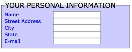
This example uses a background color. The CSS for this fieldset is:

fieldset {
font: 1em Verdana, Geneva, sans-serif;
text-transform: none;
color: #00F;
background: #CCF;
border: thin solid #333;
}
#legend {
font-size: 1.4em;
text-transform: uppercase;
color: #000;
}

example one

Example Two

This example uses a background image. The CSS for example two is:

fieldset {
font: 1em Georgia, "Times New Roman", Times, serif;
background: url(img/wave-in-blue.jpg) no-repeat center top;
border: medium dotted #3B6281;
color: #C30;
}
legend {
font-size: 1.3em;
border: medium dotted #60A4C1;
}
label {
font-weight: bold;
}


Example Three

Example three uses heavy black and white contrast. The CSS is:

fieldset {
border: thick solid #000;
}
legend {
color: #FFF;
background: #000;
font-size: 1.5em;
padding: 5px;

}

example three

See Also: Styling a fieldset with CSS.

The Cascade and ordering external stylesheet links

The Cascade in Cascading Style Sheets can determine how a web page displays. The purpose of the Cascade is to resolve conflicts when more than one rule applies to an element on an HTML page. Factors such as specificity, inheritance, and the order of the rules within a style sheet can all affect the way rules Cascade.

Most web sites use external stylesheets exclusively. There may be more than one external stylesheet attached. Some of the external stylesheets may address specific aspects of the site’s design. For example, there may be stylesheets containing only workarounds for Internet Explorer, or stylesheets that only serve to reset the browser default styles.

Another common reason for multiple linked external stylesheets is the number of possible media types that can be applied to styles. The possible media styles are:

  • all
  • aural
  • braille
  • embossed
  • handheld
  • print
  • projection
  • screen
  • tty
  • tv

Links to external stylesheets  are listed in the document <head>. The order in which these external stylesheets are listed affects the Cascade. In The Cascade by Example, I mentioned that “the closest style rules.”

Here’s an example:

<link href="CSS/2col.css" rel="stylesheet" type="text/css" media="all">
<link href="CSS/mobile.css" rel="stylesheet" type="text/css" media="handheld">
<link href="CSS/print.css" rel="stylesheet" type="text/css" media="print">

Three sets of style rules. The first one listed has the media type “all.” That style sheet will apply to all media types. The second one listed uses the media type “handheld.” The third uses the media type “print.”

What does that mean in Cascade terms?

It means that for a user viewing a page in a handheld device that recognizes this media type (some handheld devices like iPhones are capable of rendering web pages using media types “all” or “screen”) will see the page displayed according to the rules in the handheld stylesheet. The Cascade is what makes it happen.

Here’s how it works. The handheld device may see the rules in the media type “all” stylesheet and attempt to apply them. If it sees the rules in the media type “handheld” stylesheet, these rules will take precedence over the rules in the “all” stylesheet. That’s because the “handheld” rules come after the “all” rules in the Cascade. Or to put it another way, the “handheld” rules are closer in Cascade terms than the “all” rules. And the closest rule wins.

The same principle applies to printers. A printer will format using rules from the “all” stylesheet, but any rules in the “print” stylesheet can overrule those in the “all” stylesheet in determining how the printer formats and displays the page.

Handheld devices vary so widely in capability that I don’t want to make generalizations about them. But it is safe to generalize about printers. Since the “print” rules come after the “all” rules in the Cascade, the “print” stylesheet only has to contain rules needed to override something in the “all” rules. For example, the “all” rule for color may be set to black. If you want the printer to print the text in black, there’s no need to add a new rule about color to the print stylesheet. However, if the “all” stylesheet uses percentages for font sizing, you might want to write some rules in the “print” styles that set the font sizing in points, which printers interpret more accurately. The rules using points will be the ones applied by the printer, because of the Cascade.

Related Posts: