Useful Links: Diagnostic CSS, Zoe Gillenwater interview, and a couple of interesting beta releases

Diagnostic Styling Reloaded from Jens Meiert provides a bookmarklet that uses CSS to highlight accessibility issues on a web page. It points out things like deprecated elements, layout tables, missing alt attributes, style attributes and more.

Peachpit Interview with Zoe M. Gillenwater talks about Zoe’s new book Flexible Web Design and all sorts of web design issues. (Work alert: the podcast plays automatically and there are no controls to pause or change the volume.)

Collecta is a real-time search tool. It’s in beta. It checks news sites, social media streams and “popular” blogs. Take a look and see if you find it useful.

Echo is another beta you may want to check out. Echo is embedded in your site and gives you all sorts of social media features and tracking abilities.

Designing Donation Sites that Bring in the Money

There are so many causes clamoring for money and help. Ten or twenty pleas for money can drift by like a river of tweets, and then you suddenly decide to donate. Have you ever thought about why? What turns the donate switch for you? More . . .

There are so many causes clamoring for money and help. Ten or twenty pleas for money can drift by like a river of tweets, and then you suddenly decide to donate. Have you ever thought about why? What turns the donate switch for you?

The March 2009 Alertbox article from Jakob Nielsen is a report teaser titled Donation Usability: Increasing Online Giving to Non-Profits and Charities. You can get a few key points from the article, but you have to pay $98 for the full report.

Jakob Nielsen is a usability guru who publishes at useit.com and is well known for pointing out usability problems on the Web. His findings in the study about non-profits and charities that are seeking donation is summarized,

User research finds significant deficiencies in non-profit organizations’ website content, which often fails to provide the info people need to make donation decisions.

“Fails to provide the info people need to make donation decisions.” What does that mean? The article gives a few key points. First,

Non-profits would collect much more from their websites if only they’d clearly state what they are about and how they use donations.

Nielsen’s study looked at 23 non-profit websites and judged them on two tasks:

– Choosing a recipient: Participants used two non-profit sites within a given category and decided which of the organizations — which had roughly similar missions — was most deserving of a donation.
– Making a donation: Using their own credit cards, participants made an online donation to the chosen charity. We reimbursed users for this expense after the study.

He gathered up a range of test participants, all of whom had donated online before. What he found when he studied the participants’ behavior was that an organization’s mission, goals, objectives, and work was by far the most important consideration in terms of the decision to donate. People want to contribute to causes that share their values and ideals. If those goals and objectives are not clearly spelled out immediately, the donation probably won’t be made.

Social Design Notes, commented on this finding:

In my consulting work, I’ve long argued that posting a budget breakdown is an easy way to increase transparency and fundraising. (Especially since most groups already create this for their annual report.) Where possible, pegging fundraising to specific tasks and outcomes also helps.

Nielsen found other factors he said reduce donations:

The donation-killers:
– 47% were usability problems relating to page and site design, including unintuitive information architecture, cluttered pages, and confusing workflow.
– Amazingly, on 17% of the sites, users couldn’t find where to make a donation. You’d imagine that donation-dependent sites would at least get that one design element right, but banner-blindness or over-formatting caused people to overlook some donation buttons.
– 53% were content issues related to writing for the Web, including unclear or missing information and confusing terms.

At Wild Apricot, in Better Non-Profit Websites to Increase Online Donations: Usability Report, talked about the need for clear content.

In 2008, non-profits and charities collected about 10% of their donations online, according to a survey by Target Analytics, but usability expert Jakob Nielsen says the amount of money collected online could be much higher — with improved website design and content that answers the donors’ real questions.

Another key point in Nielsen’s findings is that a website (a well-designed website, that is) is good for getting impulse donations, but for long-term donor relationships, email newsletters work more effective. Follow up and keep following up.

The study also found that international non-profits with local websites could substantially improve their overall Web presence by creating a unified look-and-feel for local sites. The international site and the local site need to obviously and clearly integrate as a seamless whole.

At the elearningpost, a similar study was described. The findings are discussed in Donation Usability: Increasing Online Giving to Non-Profits and Charities

We found similar themes when we did the redesign for the National University of Singapore Giving website. We found that there was a need to inform donors on why their gifts were needed and how they will be used (the LEARN section). Also we found that there was a need to pay-back in kind by honouring donors (the HONOUR section). It goes without saying the the DONATE section had to be without flaws. So glad to know that the findings are similar across continents.

At Social Citizens Kristin Ivie summed up a number of Facts, Figures and Fodder: Online Giving studies including the Nielsen study. Another study she mentions emphasizes the importance of

aggressively working to involve people in their 20s and 30s and how to best get them onboard. Even if young donors don’t have deep pockets, they can be valuable parts of the cause in the longterm.

The lessons to be learned from the free Nielsen article by those working in the non-profit sector seems to be threefold:
1. Make your cause and goal clear and obvious
2. Make donating simple and easy
3. Maintain contact by e-mail after the original donation is made. And, of course, the email newsletters must make your cause and goal clear and make donating easy and well as keeping readers informed about progress and successes.

Cross posted at BlogHer.

Review: Build Your Own Web Site the Right Way Using HTML and CSS

A review of Build Your Own Web Site the Right Way Using HTML and CSS by Ian Lloyd is from Sitepoint (2008). More . . .

by Web Teacher
Get this book at Amaon.com

★★★★★ Build Your Own Web Site the Right Way Using HTML and CSS by Ian Lloyd is from Sitepoint (2008). This is the 2nd edition. The first edition was on my recommended list for a very long time, and I don’t see any reason to remove the second edition from that recommended list.

The book covers the basics of getting started, tools you need, and gives plenty of examples of code for both the HTML and CSS it suggests. You build a single site to completion by the end of the book with a customized Blogger blog added. The book is a foundational experience that emphasizes best practices and would get anyone off to a solid start. The last chapter deals with where to go next, what else to learn, and where to find more references.

When tools are involved, such as FTP tools, the book includes examples for both Windows and Mac. It’s well written and illustrated. In short, a very good book

Summary: Clear explanation of the basics using best practices.

Technorati Tags: ,

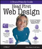
Review: Head First Web Design

A review of Head First Web Design from O’Reilly. More . . .

by Web Teacher
Buy Head First Web Design from Amazon.com

★★★★ Head First Web Design by Ethan Watrall and Jeff Siarto is from O’Reilly (2008). This book is not a basic HTML/CSS book, but is rather a look at all the processes and procedures that are involved in building a web site. The book starts with sketching designs on paper and works through wireframing, finding a visual metaphor, clear organization and navigation, design concepts like the Golden Ratio and the rule of thirds, color palettes, scannable writing techniques, accessibility, usability, jQuery libraries, blogs, business tools, and even advice on how to create a bid on a job and license your work.

It’s the everything but HTML/CSS/scripting part of the job of web design.

In general, the book is sound and delivers good information based on best practices. I was disappointed with the accessibility section. The book only discussed alt text, tabindex and longdesc. The usability suggestions were a little on the usability-lite side, too. That said, for someone new to web design, there’s a lot of good information in this book that could help you launch yourself into the field.

With any Head First book, readers need to be warned that a Head First book is not your standard technical book. It uses an approach based on educational theory and brain research that results in a barrage of visual images, surprising ways of presenting information and unique Head First style exercises designed to help you learn and retain the information. Some people react to Head First books with enthusiasm and say it’s exactly what they needed. Others regard the approach as a bit silly. Only you can judge how you will feel about the way the books are written, so take a look inside before you buy.

Summary: A good examination of the process and work flow needed in designing sites.

Technorati Tags: ,

Education leads the latest issue of A List Apart

Two of the important members of the WaSP Education Task force who have been hard at work on the WaSP Curriculum Framework (WCF) were featured in this weeks issue of A List Apart. More . . .

Two of the important members of the WaSP Education Task force who have been hard at work on the WaSP Curriculum Framework (WCF) were featured in this week’s issue of A List Apart.

Brighter Horizons for Web Education is by the WaSP Edu TF head Aarron Walter.

If you’ve interviewed candidates for positions in the web industry, you’ve probably heard firsthand the heartbreaking stories of recent graduates who are woefully unprepared to enter the workforce. When this happens, we usually respond by cursing the school that miseducated the applicant and return to our work, only to relive the experience with every new round of interviews.

No industry can sustain itself if it doesn’t master the art of cultivating new talent—an art that requires close ties between practitioners and educators. Passively watching education struggle to bridge the divide only contributes to the problem.

. . .

In our ongoing fight to establish wide adoption of standards in our profession, those of us involved in The Web Standards Project have begun trying to tackle the education issue. Industry experts and veteran educators on the WaSP Education Task Force are currently working to develop the WaSP Curriculum Framework (WCF), a modular curriculum that can be used to improve existing curricula or serve as the foundation for emerging programs.

Aarron also describes similar programs from Opera, the Information Architecture Institute, IxDA, and Web Directions North.

Elevate Web Design at the University Level by Leslie Jensen-Inman.

About a year ago, I embarked on a journey to discover where we are in web education and where we need to go.

I interviewed thirty-two web design and development leaders. Each of them expressed interest in the formal education of the next generation of web professionals. Most emphasized a challenge common to higher education: technology moves too fast for curriculum to keep up with it.

. . .

I understand these frustrations. We’re not preparing students and that has a lot to do with the educational bureaucracy and institutions. However, educators should have help shouldering the burden. In partnership, web educators and web professionals can be pioneers for change.

Leslie mentions a number of ways web professionals, businesses, and educators can work together for change.

Summary of eHow articles for December

December moon

The bare trees of December reveal a full moon rising over the Sandia Mountains. Happy holidays!

These are the articles I posted at eHow this month.

In the article called How to Have a Website on a Budget, you’ll find a list of every article I’ve posted at eHow up to now that talks about sites that provide free web design and hosting plans.

Useful Links: usability mistakes, the hook, great CSS

The Biggest Web Usability Mistakes You Can Make from searchengineland boils it all down to three simple questions.

Save the Earth: Everybody’s Doing It from Human Factors International talks about using the right hook to enlist people in your cause.

Best of CSS Design 2008 from Web Designer Wall gives us 50 good examples to look at and explains what is it about them that qualifies as a winning design.