Find the perfect font combinations

There’s FontFuse and there’s WebINK. They go together like oatmeal goes with brown sugar. One of them suggests pairs of fonts that look really good together. The other one offers up the fonts for embedding in your web pages at a reasonable price.

FontFuse offers great font pair suggestions, like this one:

font fuse

They invite you to submit your own ideas for font pairs to the site. Right now, WebINK is sponsoring a font pairing contest on the site. To enter, create a font pairing and submit it for the design community to vote on. The entrant with the most votes by Feb. 25 will receive a VIP trip for two to the 2011 SXSW Interactive event in Austin, TX in March. More details on the contest.

Which brings us to WebINK. What are you supposed to do once you have a nice font pair in mind? Why, get them from WebINK, of course.

WebINK has fonts, lots of fonts. And their pricing is pretty darn good.

webink pricing

You get the fonts at WebINK and embed them in your page using CSS.

Use the @font-face rule in your CSS.

@font-face {
font-family:'BluejackURWTMed';
src:url('http://fnt.webink.com/?drawer=9499E74E-1234-EFAP&font=1D852-7559-20B3');}

Style any element with that font:

body {font-family:'BlueJackURWTMed',san-serif;}

WebINK may not be any better than any other font source out there – I’m not trying to convince you of that. But they get points for the creative use of the sister site FontFuse. In a world where a good marketing idea can take you a long way, this seems like a winning idea to me.

I am not affiliated with either of the sites mentioned, nor did I receive anything in return for this review.

Useful Links: unsticky, internet TV, #askaconductor, local storage, search operator

25 reasons why I’ll leave your site in 10 seconds. Great read for the newbie students who are trying too much too soon.

Warning to local TV: unbundled distribution is upon you is at Terry Heaton’s PoMo Blog. This seems like a huge trend to me. In fact, I’ll be posting my own article about trends in a day or two.

Examples of Abundance in the Arts: Ask a Conductor on Twitter at Beth’s Blog is another inspiring post about how you can use social media for good. What do you think about the idea of Ask a Web Designer? That seems a great idea, too.

Wrapping Things Nicely with HTML5 Local Storage is one of the December posts at 24 Ways. (If have missed the other posts this month, check them out, too) A great intro and explanation for local storage from Christian Heilmann.

An Undocumented Google Search Operator is a very helpful tip.

Useful Links: Difficult Fonts, Hardboiled, Firesheep

Making things hard to read ‘can boost learning’ at BBC News says that reading something in a “harder” font can boost retention of the information. The easy font they tested was Arial at pure black. The hard fonts tested were Comic Sans and Bodoni, both at 75% grayscale. Does that mean that if I can decipher something in your scratchy handwriting, I’ll remember it forever?

Hardboiled Web Design is a new book by Andy Clarke. I haven’t seen the book yet, but I have to say that the book website is creative and beautifully designed. Bodes well for the book, don’t you think?

Firesheep. A new Firefox extension that is about to set off a firestorm. Read Firesheep In Wolves’ Clothing: Extension Lets You Hack Into Twitter, Facebook Accounts Easily and How to Protect Your Login Information from Firesheep immediately. Both are at TechCrunch.

Useful links: Influence, Font Previewer

From The Access Point, a listing of the most influential women’s voices on the web.

ABIE from Access Communications

The Access Point is using the post/graphic to bring attention to their new  ranking tool, ABIE, that “determines online influence based not only on data from the top ‘ranking’ services out there, but also on factors such as audience engagement levels and the frequency original content is shared across the social Web.” I don’t see where they’ve done a similar thing for influential men.

Google Font Previewer is super helpful. As I mentioned in an earlier article, Embedding fonts the Google way, it’s very easy to use fonts from the Google font directory. Now Google has provided an app that lets you pick one of their fonts, apply some CSS3 text-shadow, and set a few spacing options. You see how it looks in the preview.  It spits out some code you can copy.

This font is called Lobster. Here’s how I made it look in the preview.

words set in lobster font

This is the code the app provided:

<link href="//fonts.googleapis.com/css?family=Lobster:regular" rel="stylesheet" type="text/css" >
<style>
body {
font-family: 'Lobster', serif;
font-size: 28px;
font-style: normal;
font-weight: 400;
text-shadow: 2px 2px 2px #aaa;
text-decoration: none;
text-transform: none;
letter-spacing: 0.024em;
word-spacing: 0em;
line-height: 1.13em;
}
</style>

The code could use a bit of editing to remove unused properties (e.g. text-transform: none;), but it is a time-saver to see how text is going to look with the text-shadow styling.

Improve readability with line-height

The CSS line-height property determines the distance or spacing between the lines of text on the page. In the print world, this property is called leading.

Line-height can be applied to any text element, but it’s probably best to set it in the CSS rule for body in your stylesheet. All the textual elements on your page will inherit that line-height value, which can be adjusted if needed for specific parts of the page.

The perfect line-height will depend on your choice of font-family. In my examples, I’m using a sans-serif font. Some fonts are “taller” than others. Tahoma looks good at 1.5, but Times Roman might not. Generally, you don’t want the lines to be too close together or too far apart. You want enough space between the lines to create maximum readability, or the appearance of ease of reading. You want an open and inviting look rather than a  “dense” look, which discourages reading.

I applied different line-height values to some paragraphs so you could see the effect. The rule used in each example is a variation of

p {
font: 1em/1.2 Tahoma, Geneva, sans-serif;
}

To give you the same rule not in CSS shorthand, it would be

p { font-size: 1em;
line-height: 1.2;
font-family: Tahoma, Geneva, sans-serif;
}

Notice that there is no unit attached the the line-height value. No px, %, or em units should be assigned to the line-height value.  In each example, I put the variation in the line-height rule at the beginning of the image so you could judge for yourself what the effect was.  Which examples look the most readable to you? Which encourage reading, which discourage reading?

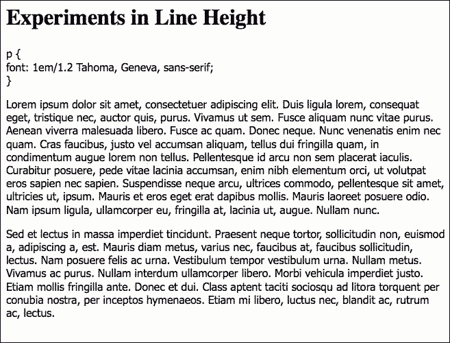
Example 1

I’m not even going to show you how it looks if left at the default value, which would be 1. It’s a bit crowded at 1.2.

lineheight1.2

Example 2

I find 1.5 attractive for this font. It’s open and looks easy to read.

lineheight1.5

Example 3

Even at 1.8, the line-height is still working for me. It’s approaching the point of being too much, and I think 1.5 is better, but it still works. (I’d look at 1.6 or 1.7 before deciding for certain.)

lineheight1.8

Example 4

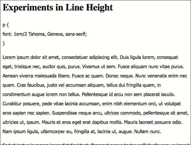
With a value of 2, I think the lines are so far apart that readability is impaired for this font. With so much distance between the lines, you lose the sense of proximity that tells you that these lines belong together in a semantic unit.

lineheight2

Useful links: Thatcher on accessibility, ReadSmart, Opera turns 15

A look at whitehouse.gov, a tool to improve reading comprehension, Opera celebrates its 15th with a retro bash.

Accessibility of the White House Web Site by Jim Thatcher is a quick survey some of the accessibility issues that could be easily corrected on the WhiteHouse.gov web site. Do you have these problems on your web site?

How text formatting can enhance the readability and persuasiveness of text at HFI Connect gives the results of a test of ReadSmart technology, which makes subtle changes in the formatting of text that are proven to improve comprehension.

Opera celebrates its 15th birthday with a retro celebration splash page that you should see before it disappears. While you’re there, download the latest version of this great browser.

Useful Links: Social Media Products, Typefaces, SXSW photos

Useful links: good resources for using social media, periodic table of typefaces, SXSW photos.

Resources: Web 2.0 Social Media Products, a guide on what to use lists the essentials. Handy.

Periodic Table of Typefaces is brilliant. The teacher in me wants to know where to order poster-size prints for the classroom wall. Hey, Behance, why not team up with Visibone to get this gem published? Visibone already has a direct line straight onto the walls of web design classrooms all over the world.

I’ll be posting photos from SXSW Interactive for the next few days at Flickr. I’m veesees on Flickr.