When to use the null alt option for images

The standards set in WCAG 2.0 state:

Guideline 1.1 Text Alternatives: Provide text alternatives for any non-text content so that it can be changed into other forms people need, such as large print, braille, speech, symbols or simpler language.

Among those text alternatives is where alt text (or alternative text) for an image is used.

The HTML5 specification states that all images must have an alt attribute. Here’s the fine print. All images must have an alt attribute, but there are times when the alt attribute can be empty or null. That is, the attribute has to be there, but there might be nothing in it. Like this:

<img src="image.png" alt="">

When is null alt text acceptable?

There are times when the text surrounding an image gives the alt text of the image. It’s part of the content. Therefore, to put the same information in an alt attribute becomes redundant and unnecessary.

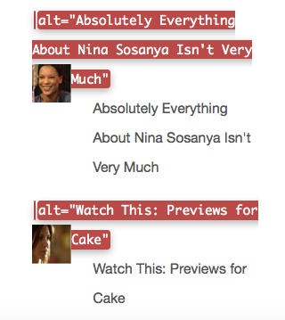
Here’s an example from the blog Old Ain’t Dead in the section where the most popular posts are displayed. Alt text is shown using the tools in the Web Developer Toolbar.

An example of redundant alt text.
The alt text and the clickable link are the same

You can see that the alt text for the image is exactly the same as the link text that goes with it. On a screen reader, a user would have to listen to the same text read twice. It would be better if these images had null alt text because the function of the link is explained by the text accompanying it.

Look at how Twitter deals with null alt text.

Jeffrey Zeldman's Twitter image receives no alt text
An example of null alt text

If the alt text for Twitter avatars was not null, but in fact contained the name of the Twitter account, then the name would be spoken twice in a screen reader. In the example above, with null alt text, you would hear “Jeffrey Zeldman” spoken once only because of the null alt text.

Even if you couldn’t see the little profile image, you’d still know it was Jeffrey Zeldman’s twitter account.

What about when images are not loaded or otherwise not displayed by the browser?

If you consider the two examples already mentioned – the list of top posts and the Twitter avatars – in neither situation would null alt text on the image result in the user becoming confused. The information is there in text form and it’s all that is needed.

What if the text surrounding the image does not explain what the image is?

In that case, put a description in the alt attribute that explains the function of the image or provides the content of the image.

Twitter Writes a Post about role=presentation

There is an ARIA role called “presentation” in the WAI ARIA spec. With Twitter’s help, Denis Boudreau wrote this post about it.

This is how it started:

Then @jsutt took up the idea with this:

Denis Boudreau to the rescue!


As you see, this ARIA role has specific and limited use. I wasn’t sure where a front end developer who was only working with semantic HTML would even consider using it.


Oh, at last the light dawns. This is what developers building apps sometimes need to do. Even at that, go back to point one about only using it when you really know what you’re doing and are absolutely sure you want to strip an element of its semantics.

Denis draws us to a sensible conclusion.


Some Teaching Tips for HTML5 and CSS3 7th Edition

Where I teach, we use HTML5 & CSS3 Visual QuickStart Guide (7th Edition) to teach both the basic HTML and the CSS class. This version of the book came out in 2011.

There’s an 8th Edition released in 2013, but we haven’t switched to it yet. I’m sure we will soon, but for the moment, we are using the 7th edition.

Here are a few teaching tips if you are using the 7th edition, as I currently am.

  • At the time this book was written, there was no <main> element in the spec. I suggest you change the layout suggested in Chapter 3 to use the <main> element for the left column. Use the landmark role role="main" with it.
  • Chapter 3 contains a clear explanation of the purposes and uses of both the <section> and <article> element. If you want, you can include an example of these two elements inside the <main> element.
  • Remember that <hgroup> has disappeared from the spec.
  • The example files all show empty elements such as <img> with a closing forward slash included: <img />. This provides a perfect opportunity to talk about backwards compatibility, XHTML, and some of the personal choices that are acceptable when writing HTML5.

What are Implicit ARIA Roles?

For a while now, I’ve been seeing mentions of implicit ARIA roles as something web designers and developers should be aware of and know how to use.

In the case of ARIA roles, the word implicit means that the browser interprets certain HTML elements semantically and treats them as if an ARIA role were assigned to them. In these situations, the web designer does not specifically need to add the role attribute to the element. The addition of the ARIA role is considered redundant in some situations.

If you do add the role information, it does no harm, but, in my opinion, it’s best practice to know when you do need to add it and when you don’t.

For elements that have been around for a while, say the a (anchor) element, the browser implicitly assigns a role="link" attribute.

For the newer HTML5 semantic structural elements, browsers already have some of the roles built in. This improves as browsers add support. A header element that is not a descendant of an article or section element is implicitly assigned role="banner". A footer element that is not a descendant of an article or section element is implicitly assigned role="contentinfo". There are a number of other cases like this as browsers add support for HTML5. They are detailed at the W3C in two tables. This table shows strong native HTML semantics with default ARIA semantics. Just under it, this table lists the default implicit ARIA semantics for many other elements, along with any restrictions that apply.

In addition to the information at the W3C, check out this article by Steve Faulkner: HTML5 Accessibility Chops: When to use an ARIA role.

Contrast Ratio: A New Color Contrast Tool

Here’s a very nice new tool for checking color contrast against WCAG 2.0 standards for accessibility. It was created by Lea Verou and is called Contrast Ratio.

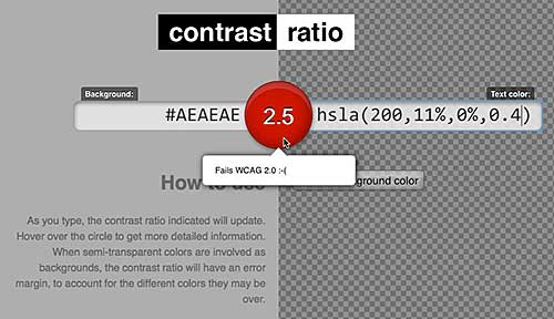
The tool allows you to swap text color and background color. It permits the use of transparency in both text color and background color. If your color choices fail to meet the WCAG 2.0 standards, the ratio button in the middle of the page turns red. Hovering over the button tells you how many, if any, of the WCAG 2.0 standards your colors meet.

Hover over the middle button to see how you're doing
Hover over the middle button to see how you’re doing

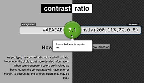
Bump up the level of opacity a bit on this color scheme and it passes.

A passing color ratio

Directions on the page explain some fancy ways to change the values for text and background colors. These are fun and time saving, but the real value in the tool comes from the clear and obvious way it reports on how the colors test out against WCAG 2.0 standards.

Help Knowbility with this Indigogo project

Knowbility is a superb organization offering accessibility training, accessibility conferences, and accessibility information to web designers and developers. Now they want to develop online accessibiity training modules and they need your help.

Please contribute to the Indigogo campaign for this worthy project.

How to Use the WAVE tool to Test and Boost Site Accessibility

Did you hear? A website should be accessible to everyone who comes to visit. Yeah, I’m sure you’ve heard that. But how do you know if you have an accessible site? There are all sorts of rules and checks involved in accessibility, but if you’re working with a WordPress blogger who just wants to do the best with limited knowledge, there’s one tool that can be a big help. It’s the WAVE tool from WebAIM.

How to use the WAVE tool to test and boost site accessibility

The WAVE tool tests accessibility. Many other tools do the same thing, but this one is particularly user friendly and helpful.

Start by entering your URL in the opening screen.

The WAVE tool URL entry form

The tool churns away for a while, and finally posts a shot of your blog with icons all over it. Each icon tells a story about some accessibility feature of your blog.
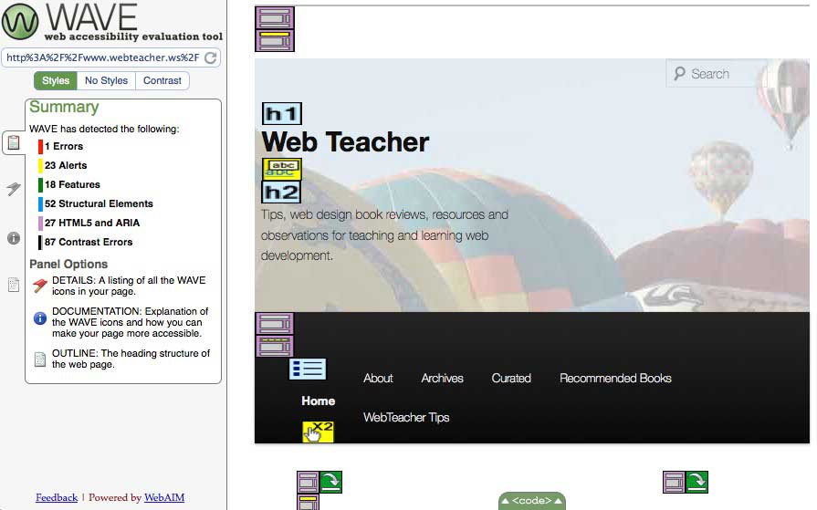
The WAVE tool results show icons on various parts of your blog

The default results page shows you a summary in the sidebar. It lists errors (red icons), alerts (yellow icons), features (green icons), structural elements (blue icons), HTML5 and ARIA elements (lavender icons), and contrast errors (which don’t show up as icons). Above the summary results are buttons to let you look at the page with no styles, or to view only the contrast errors. To the left of the summary panel, you can opt to see details, documentation, or an outline of the page structure.

Click on any WAVE tool icon for more information

On the right, where your web site is pictured, you can click on any icon to get a brief explanation and a link to more information. In this image, the yellow alert icon is telling me that the link in the date goes to the same place as the link in the H1 heading just before it. This isn’t great, but it also is something about WordPress that I cannot change easily. I’ll get into what you can and cannot fix easily in just a bit.

You can look at the code for the items the icons mention if you click the “code” tab at the bottom.

The code panel shows you the code related to any icon you click on the page of WAVE tool results

When you click the “code” panel, you go right to the code for any icon you click.

Fixes: Dealing with Content

The easy fixes for WAVE tool errors and alerts all deal with the content of your page. This is the stuff you control when you enter a new post.

  • WAVE looks for alt text on images. The WordPress image uploader always wants to add title text—you don’t need that. You do need alt text that describes what your image is and how it functions as part of your content.
  • The WAVE tool checks for structural elements like headings and lists. Headings are important in terms of organization, structure, and information hierarchy. These should be real headings made from tags that begin with “h,” like h1 or h2 or h3, and not some words that you’ve made bold. Headings also help with navigation for users on assistive devices like screen readers.

If you don’t have these two features on your page, you need to change your habits as you write your content. Add the alt text as you embed images, and make headings using the formatting tools in the tool bar as you write your post.

Fixes: Dealing with CSS

You may have errors that relate not to how you enter content, but to the CSS for your blog. Perhaps your color scheme lacks enough contrast for certain users. In How (and When and Why) to Set Up a Child Theme in WordPress, I explained how to change the CSS in your blog with a child theme. If you need to increase color contrast or make other changes involving styles, a child theme is the way to do it.

Fixes: Dealing with Code

Some errors and alerts come out of the code that comes from WordPress. Sometimes errors like these are easy to fix; sometimes they are not. I pointed out a case above where duplicate links were shown in an alert. That’s just going to be that way on my blog.
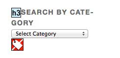
The WAVE tools error for a lack of label on a form field.

There’s an error on my blog because the select menu for my categories doesn’t have a label. The category menu is a widget. There’s no way to get into the code for this widget. Knowing about the error made me do the best I can with the heading right before the select menu. I hope the heading helps, but this error is just going to stay an error.

The WAVE tool looks for ARIA landmark roles

The WAVE tool looks for ARIA landmark roles. If your theme is missing them—that’s a code problem that’s easy to fix. The fix uses a child theme. In Think about ARIA roles when choosing a WordPress theme, I explain how to insert ARIA landmark roles in your code. It’s easier than it sounds.

Getting started with accessibility can be daunting because there are so many details involved, but the WAVE tool can guide you on your way. Run your blog through it. Fix any errors and alerts you can fix. If you absolutely cannot fix something, so be it. But if you can correct an error with a simple change of habit—or by implementing a few easy changes —it will make a huge difference to your users.

Go back to the WAVE tool every once in a while, and retest yourself to make sure you’re still on track.

GoDaddy Managed WordPress is built from the ground up for maximum performance, security and ease of use. Click here to experience the difference.