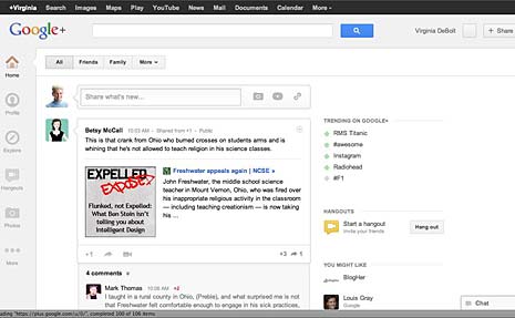
Google+ made some changes and upgrades last week and I thought it was time to take a second at this site, both to see what’s new and to discuss helpful features. Google announced the changes on the Google blog in Toward a Simpler, More Beautiful Google.
If you are familiar with Google+, you can see from the image the look has changed to something sleek and minamalist. Google describes it as “more functional and flexible.” Google touts the new navigation, saying,
- You can drag apps up or down to create the order you want
- You can hover over certain apps to reveal a set of quick actions
- You can show or hide apps by moving them in and out of “More”
A few of the other changes (you can get the full list in this video) are easier ways to join conversations, ways to track activity around conversations you’re following, and a page just for Hangouts. Some of the menu items pop out for more precise options, such as the Photo menu.
The Profile page changed to include something that bears a whole lot of similarities to the Facebook Timeline, with a large image. Take a look at how She Geeks describes the Profile changes in Google Receives a Fresh Redesign that You Might Like.
The redesign raised the hackles of developers whose apps broke, and engendered a mocking meme about whitespace. You can explore those issues in Google Introduces a Familiar Redesign and Google Angers Developer with Google+ Redesign.
Getting the Most from Google+
After several months using Google+ it remains way down on the list of social networks I check regularly. Perhaps I’m not following enough people to get the value I was hoping for from it, but I don’t find it especially important – yet. I think the Hangouts feature is terrific, but people I’d like to share a Hangout with (for example, my book discussion group) are not all on Google+.
Even so, I’ve learned some tricks that help me get the most from Google+. They seem almost secret, because they are a bit hidden. If you take a second look at the site now to check out the new look, perhaps these tips will help you get more out of Google+.
The first almost-secret is circle volume control. It’s a bit tricky to find.
Start in your stream with the Home button. Then pull down the More menu and select a circle. I picked my circle called BlogHers. That will bring posts from BlogHers to the top of my stream. And, it brings up a volume control slider to the right of the page.
Use the slider to determine the amount of volume as a percentage of your total stream you want to see from the chosen Circle. I find this really helpful. I recently added a circle called Women Who Work in STEM, and, wow, those women are talkative! I can turn the volume down on those posts, while getting more volume from my BlogHer circle.
The second almost-secret is Sparks. A Spark is basically a saved search. I searched on the keywords “web design.” You see the results immediately, of course, but when the results appear, a button to “Save This Search” also appears. Click it and your search is saved.
I saved another search, too. This one was for “social media.” Now, when I’m on the Home page looking at my stream, I can find both those searches in the More menu and check for new search results anytime.
Your Reaction?
As with any change, reactions to new design are mixed. It’s interesting to use Google+ to search for “Google+ redesign” and see the mixed reactions. My personal reaction is, “Oh, Google+ changed.” What’s your response?
Honestly, I’m more excited about using features that were there all the time like the Volume Control and Saved Search. The new design is just “Okay. Thanks for letting me know.”
Editor’s Note: All screen captures from Google+ by Virginia DeBolt. Cross-posted at BlogHer.


